“We’ve looked at their new results versus our data, and it does appear that the new warming they’ve ‘found’ is just spurious warming in the old (poorly-calibrated, and orbit time-drifting) NOAA-14 MSU instrument, which they leave in the data analysis,” Roy Spencer, a climatologist at the University of Alabama in Huntsville, told TheDCNF.
“We remove that spurious warming since it disagrees with the newer (better calibrated, non-drifting) NOAA-15 AMSU instrument flying at the same time,” Spencer said.
[….]
The new RSS data runs much higher than UAH satellite data, run by Spencer and Dr. John Christy, which only shows a warming trend of 0.072 degrees Celsius per decade. RSS also runs hotter than weather balloon data, which show about the same or less warming than UAH data.
One of the issues that have recently come up in conversation is that the Satellite data has been wrong for essentially 19-years is showing a pause in global warming… even though mankind has produced almost two-thirds of the CO2 since the Industrial revolution in that same time. U.S. News and World Report puts it thus:
Climate change doubters may have lost one of their key talking points: a particular satellite temperature dataset that had seemed to show no warming for the past 18 years.
The Remote Sensing System temperature data, promoted by many who reject mainstream climate science and especially most recently by Sen. Ted Cruz, now shows a slight warming of about 0.18 degrees Fahrenheit since 1998. Ground temperature measurements, which many scientists call more accurate, all show warming in the past 18 years.
“There are people that like to claim there was no warming; they really can’t claim that anymore,” said Carl Mears, the scientist who runs the Remote Sensing System temperature data tracking.
The change resulted from an adjustment Mears made to fix a nagging discrepancy in the data from 15 satellites.
The satellites are in a polar orbit, so they are supposed to go over the same place at about the same time as they circle from north to south pole. Some of the satellites drift a bit, which changes their afternoon and evening measurements ever so slightly. Some satellites had drift that made temperatures warmer, others cooler. Three satellites had thrusters and they stayed in the proper orbit so they provided guidance for adjustments.
Mears said he was “motivated by fixing these differences between the satellites. If the differences hadn’t been there, I wouldn’t have done the upgrade.”
NASA chief climate scientist Gavin Schmidt and Andrew Dessler, a climate scientist at Texas A&M, said experts and studies had shown these problems that Mears adjusted and they both said those adjustments make sense and are well supported in a study in the American Meteorological Society’s Journal of Climate….
This “orbital drift” is based on a paper by Carl A. Mears and Frank J. Wentz, which was first submitted to Journal of Geophysical Research, and had the paper rejected. They then “revamped” the paper, and turned it into the Journal of Climate. Keep in mind that there are only two groups working on this stuff… it is a highly specialized field, and Dr. Roy Spencer and Dr. John Christy were and are key to understanding this data set and any changes to it (see appendix). Anthony Watts asked about the paper and their review of it:
UPDATE1: Given this sort of work has only two groups doing it, it is a very narrow field of scientific specialty, I asked Dr. Spencer this question:
I assume neither you or Christy were asked to review this paper? There aren’t many satellite temperature data experts in the world.
He replied:
Interesting question…. John reviewed their original paper submission to Journal of Geophysical Research, in detail, asking for additional evidence — but not advocating rejection of the paper. The JGR editor ended up rejecting it anyway. Mears & Wentz then revised the paper, submitted it to Journal of Climate instead, and likely asked that we be excluded as reviewers.
As it turns out ~ there is something afoot. Three excellent posts…
JUDITH CURRY notes that the revised paper was not peer reviewed by these two juggernauts in the satellite “maintenance” — also noting that really we (myself included) are prematurely discussing this issue:
The climate models project strong warming in the tropical mid troposphere, which have not been borne out by the observations. The new RSS data set reduces the discrepancies with the climate model simulations.
Roy Spencer’s comments substantially reduce the credibility of the new data set. Their dismissal of the calibration problems with the NOAA-14 MSU is just astonishing. Presumably Christy’s review of the original submission to JGR included this critique, so they are unlikely to be unaware of this issue. The AMS journals have one the best review processes out there; I am not sure why Christy/Spencer weren’t asked to review. I have in the past successfully argued at AMS not to have as reviewers individuals that have made negative public statements about me (not sure if this is the case with Mears/Wentz vs Spencer/Christy).
There is a legitimate debate on how to correct for the diurnal cycle, but based on my assessment, the UAH empirically based approach seems better.
With regards to the ‘pause.’ The ‘pause’ in warming has generally been assessed using the lower tropospheric temperatures, which aren’t yet available from the new dataset. So it is not yet clear what impact the new data set will have on our interpretation of the pause.
With regards to the Feb 2016 spike, I think Bob Tisdale gets it mostly right. While a spike from the El Nino is expected, the Feb 2016 seems anomalous and largely associated with a warm spike in the Arctic (of ‘weather’ origin). I would expect a few more months of anomalously warm temperatures before the El Nino fades. I’m not sure what to make of the ‘re-emergent blob’ scenario.
We won’t know what the 2016 El Nino spike looks like until the end of the year. Then we can compare the 1997/1998 temperatures with 2015/2016 temperatures in a (cherry-less) apples to apples comparison, to assess the underlying trend in temperatures from 1998-2016. The trend will undoubtedly be positive, but most likely it will remain substantially less than the trend predicted by the climate models.
And what of the years following 2016? Will we see cooling and then a continuation of flat temperatures? Or continued warming? I suspect that there will be some cooling and continued flatness. I’ve stated before that it will be another 5 years before we have the appropriate prospective on the current temperature fluctuations and whether or not the early 21st century pause is over.
We just have to grab some popcorn and watch…better stock up, this is gonna take a while.
But still worth noting, EVEN IF you include the new data… we see modeling waaay overblown:
Without the new — I would say, messaged data from one satellite — we see a great comparison lining up of many tracks of reliable temps:
The models are 100% wrong. 100%
APPENDIX
…For their achievement, the Spencer-Christy team was awarded NASA’s Medal for Exceptional Scientific Achievement in 1991 and a Special Award by the American Meteorological Society in 1996 “for developing a global, precise record of earth’s temperature from operational polar-orbiting satellites, fundamentally advancing our ability to monitor climate.” In January 2002 Christy was inducted as a Fellow of the American Meteorological Society.
The data is published monthly, available for all to review. The satellite measurements have been a lightning rod for those who advocate that human emissions of greenhouse gases, particularly carbon dioxide (CO2), are causing significant global warming. There have been three relatively minor errors in the calculations that, when determined, were promptly corrected. Which is how science should work. The corrections involved orbital decay, orbital drift, and the cooling of the stratosphere. The measurement of temperatures, from the surface to roughly 50,000 feet (15 km) altitude, includes the layer for the “Hot Spot” and avoids the cooling stratosphere.
Calculations are now made by three separate groups, UAH, Remote Sensing Systems (RSS), and a group with the University of Washington. In addition, Christy uses four separate sets of radiosonde data from weather balloons to verify his work. The correspondence among these datasets is very close.
Also, Christy served as a contributor or lead author (2001) to the first four reports by the UN Intergovernmental Panel on Climate Change.
As state climatologist, Christy stated that, according to global climate models, the Paris Agreement to cut CO2 emissions will have an impact on temperatures so small that it cannot be measured. Further, he stated that based on research, if surface temperatures are used to estimate the greenhouse effect, daytime highs better serve the purpose than nighttime temperatures or averages. Daytimes highs are less influenced by changes in land use such as urbanization
[….]
John Christy exemplifies the perseverance, dedication to empirical science, and humanity befitting the Frederick Seitz Memorial Award.
This post will be an extended rebuttal to a portion of a much longer discussion. It is in response to the cartoonists website, SKEPTICAL SCIENCE, which has been responded to in a manner that should undermine it’s validity. But alas, it does not. So first let me post the graphic that caused the person to run to this propaganda site for a rebuttal:
The year 1934 was a very hot year in the United States, ranking fourth behind 2012, 2006, and 1998. However, global warming takes into account temperatures over the entire planet. The U.S.’s land area accounts for only 2% of the earth’s total surface area. Despite the U.S. heat in 1934, the year was not so hot over the rest of the planet, and is barely holding onto a place in the hottest 50 years in the global rankings (today it ranks 49th).
There are some preliminary thoughts on this before we get into the “nitty gritty.” First, in 1933-1936 (the heat wave and wild weather span), how many countries or persons were recording weather and temperature anomalies? Common sense says that of course, not nearly as much as today. We only started measuring with satellites since 1979. Another head-tilter would be have or did the NOAA or NASA previously note other years as warmer — in the past? We will find this out as we go along.
As you read this stuff (follow links to stories, and the like), that some sites just use the basic data without correcting it. I will discuss this later in the post… but first and foremost, are there reports from those years showing temperature and weather anomalies from around the world? Yes. Here is some evidences:
Mind you, this is a small sampling from THE NO TRICKS ZONE, many more examples can be found at C3 HEADLINES, as well as a site documenting the United Kingdom’s weather for some years. So it seems that we are looking at a few year GLOBAL weather pattern. AGAIN, we did not have satellites then so we can rely on eyewitness accounts such as these.
However, I wanted to comment on some of the wrong data being used or fudged data to make climate look worse now than in the past. I have to thank the person I was discussing the issue with, because he had posted a story linked to the journal, Nature. All it had was an abstract, and while I am a member of the AAAS, the Nature journal subscription was too much. There were also a list of corrections, so I asked him for either a full article and/or some links to the corrections. Lo-and-behold he gave me a link of a corrected graph that worked in my favor:
The red area is what concerns me… but even with it is has been warmer in the past (to note the bottom line). A professor at Berkeley notes that there is a collusion between some to hide the data that counters the narrative from the “warmists.” Mind you, the following video is for 2014, but I will make a point afterwords:
MRCTV BLOG notes the following that will throw a stone into the shoe of the left about 2015 being the hottest year. Remember, the internet never forgets!
…To explain where NOAA messed up, we have to start with 1997.
In that 1997 report, they say clearly that the Global Average Temperature (GAT) was 62.45°F, based on a 30-year average (1961-1990) of the combined land and sea surface temperatures. Since we know the 1997 El Nino caused a record high spike in temperature, that means that for that 30 year period, there was no warmer GAT than 62.45°F up until that time.
Now, back to 2015. The recently released NOAA report, claiming that 2015 was the hottest year ever, says:
During 2015, the average temperature across global land and ocean surfaceswas 1.62°F (0.90°C) above the 20th century average. This was the highest among all 136 years in the 1880–2015 record, surpassing the previous record set last year by 0.29°F (0.16°C) and marking the fourth time a global temperature record has been set this century.
It was blogger Wattsupwiththat who first noticed and explained the funky math. He explains that the recent report compares 2015 to the 20th century average – but, doesn’t mention what that average temperature was.
However, it does give a 20th Century average in its November 2015 State of the Climate Report: – 13.9 degrees Celsius (57 degrees Fahrenheit):
Now, it’s math time:
According to NOAA, the global average temperature for the 20th century was 57 degrees Fahrenheit.
And the 2015 average was 1.62 degrees Fahrenheit above that average.
In other words, according to this recent NOAA report, 2015 was the hottest year ever at 58.62 degrees Fahrenheit (57+1.62).
And, that 1997 NOAA report states 1997 had an average global temperature of 62.45 degrees.
….According to my calculator:
1997’s 62.45 degrees is 3.83 degrees Fahrenheit higher than 2015’s 58.62 degrees Fahrenheit, meaning that – using NOAA’s own numbers – 2015 cannot be the hottest year on record.
As suggested monthly by the mainstream media since April 2015, NOAA and NASA officially declared that 2015 surpassed the 2014 record to become the new hottest year on record and that 2016 could be hotter than 2015! The average global temperatures calculated by NOAA and NASA, however, appear to be inaccurate and unreliable for the following reasons:
In Table 2, we’ve compiled the top five years when the most records were set. When multiple years tie for the high, each individual year gets a fraction of a “record”. So, for example, 1954 and 1933 each get a half of a record for Colorado.
According to data on the NOAA website, 1997 was truly the hottest year on record at 62.45 oF. The average global temperature in 2015 was 58.62 oF or 3.83 oF below the 1997 temperature.
According to data on the NOAA website, the temperatures such as the 20th century average temperature and annual temperature anomalies, which must be fixed, have different values in the annual global analyses.
NOAA and NASA corrected historical temperature data and fabricated temperature data in areas without temperature record systematically, widely, and uni-directionally to “cool” the past in an attempt to prove the soaring temperature trend.
NOAA and NASA made efforts to discredit their own satellite data – which is consistent with the balloon data – because it suggests a global warming hiatus since 1998 contradicting with the NOAA and NASA preferred narrative.
NOAA and NASA refused to give data and information requested by the US House of Representatives Science, Space and Technology committee. There is no reason for them to withhold the data and information, which are public domain, unless they have something to hide.
The headline “last year was the hottest year on record, this year is hotter than last year, and next year could be hotter than this year” is likely to be repeated years after years until funding for climate change is stopped!
The National Center for Policy Analysis, mentions a change a few years back:
The warmest year on record is no longer 1998 and not because it has been overtaken by a recent heat wave. National Aeronautics and Space Administration (NASA) scientist James Hansen’s famous claims about 1998 being the warmest year on record in the United States was the result of a serious math error, according to H. Sterling Burnett, a senior fellow at the National Center for Policy Analysis (NCPA).
According to NASA’s newly published data:
The hottest year on record is 1934, not 1998.
The third hottest year on record was 1921, not 2006.
Three of the five hottest years on record occurred before 1940.
Six of the top 10 hottest years occurred before 90 percent of the growth in greenhouse gas emissions during the last century occurred.
Here we see raw data vs. messaged data run through a hopper. In 2007 NASA adjusted it’s U.S. findings to match the real data:
The measured USHCN daily temperature data shows a decline in US temperatures since the 1930s. But before they release it to the public, they put it thorough a series of adjustments which change it from a cooling trend to a warming trend.
[….]
The next blink comparator shows changes in the US temperature record from GISS. It alternates between their 1999 graph and the 2012 version of the same graph. The past is cooled and the present is warmed.
Here are some examples of fudged data because of sub-standard equipment:
You’d think the answer would be obvious, but here we have a NOAA operated USHCN climate station of record providing a live experiment. It always helps to illustrate with photos. Today I surveyed a sewage treatment plant, one of 4 stations surveyed today (though I tried for 5) and found that for convenience, they had made a nice concrete walkway to allow servicing the Fisher-Porter rain gauge, which needs a paper punch tape replaced one a month.
Here is what you see in visible light:
Here is what the infrared camera sees:
Note that the concrete surface is around 22-24°C, while the grassy areas are between 12-19°C
Class 5 (error >~= 5C) – Temperature sensor located next to/above an artificial heating source, such a building, roof top, parking lot, or concrete surface.”
More than half of the stations the NOAA use are tainted or wrongly placed equipment. Here is an example of a well maintained station with data sets:
Here is data sets corresponding to a site where heat corrupts the data:
Here are even more corrupt examples of these stations placed next to air conditioner outlets, next to burners, next to lights that glow at night, asphalt surrounding them and buildings that radiate heat as well as block wind (NOTE this continually growing accumulation of these sites at WUWT):
CHANGING DATA-SETS
Another example of changing averages was noted by Steve Goddard and others — even the NOAA have acknowledge it — have been discussing recently is exemplified in Dr. Judith Carry’s post on the matter (from a larger post of mine):
Even the Wall Street Journal chose the higher temperature reading to say that July of 2012 was July was the “hottest month in the contiguous U.S. since records began in 1895.” WUWT found this on accident and it has led to quite a few other revelations as we will see. Here is description in part of what we looking at:
Glaring inconsistencies found between State of the Climate (SOTC) reports sent to the press and public and the “official” climate database record for the United States. Using NCDC’s own data, July 2012 can no longer be claimed to be the “hottest month on record”.
[….]
I initially thought this was just some simple arithmetic error or reporting error, a one-off event, but then I began to find it in other months when I compared the output from the NCDC climate database plotter. Here is a table of the differences I found for the last two years between claims made in the SOTC report and the NCDC database output.
[….]
In almost every instance dating back to the inception of the CONUS Tavg value being reported in the SOTC report, there’s a difference. Some are quite significant. In most cases, the database value is cooler than the claim made in the SOTC report. Clearly, it is a systemic issue that spans over two years of reporting to the press and to the public.
It suggests that claims made by NCDC when they send out these SOTC reports aren’t credible because there are such differences between the data. Clearly, NCDC means for the plotter output they link to, to be an official representation to the public, so there cannot be a claim of me using some “not fit for purpose” method to get that data….
The Wall Street Journal made a graph showing this record setting month (below-left). The more accurate temperature for July likewise is shown in the same graph (below-right):
This looking at the data sets chosen and what is used and isn’t used to support an idea that fails in every way. Combine this obvious cherry-picking with the bias, collusion, and charges against the report that the President used to route Congress, all show we have a problem Houston! But this is only the tip of the proverbial iceberg. It seems the NOAA has been skewing these temps for some time. Why? Because the left uses this as a way to promote an ever growing government and the scientists get more-and-more funding. This data fudging story is newer, and it is evolving quickley, including this newest post via Real Science where Steve Goddard notes that More Than 40% Of USHCN Station Data Is Fabricated. Here is Dr. Judith carry’s synopsis (excerpted), in which she critiques a bit Goddard’s post… but then bows to the evidence:
OK, acknowledging that Goddard made some analysis errors, I am still left with some uneasiness about the actual data, and why it keeps changing. For example, Jennifer Marohasy has been writing about Corrupting Australian’s temperature record.
In the midst of preparing this blog post, I received an email from Anthony Watts, suggesting that I hold off on my post since there is some breaking news. Watts pointed me to a post by Paul Homewood entitled Massive Temperature Adjustments At Luling, Texas. Excerpt:
So, I thought it might be worth looking in more detail at a few stations, to see what is going on. In Steve’s post, mentioned above, he links to the USHCN Final dataset for monthly temperatures, making the point that approx 40% of these monthly readings are “estimated”, as there is no raw data.
From this dataset, I picked the one at the top of the list, (which appears to be totally random), Station number 415429, which is Luling, Texas.
Taking last year as an example, we can see that ten of the twelve months are tagged as “E”, i.e estimated. It is understandable that a station might be a month, or even two, late in reporting, but it is not conceivable that readings from last year are late. (The other two months, Jan/Feb are marked “a”, indicating missing days).
But, the mystery thickens. Each state produces a monthly and annual State Climatological Report, which among other things includes a list of monthly mean temperatures by station. If we look at the 2013 annual report for Texas, we can see these monthly temperatures for Luling.
Where an “M” appears after the temperature, this indicates some days are missing, i.e Jan, Feb, Oct and Nov. (Detailed daily data shows just one missing day’s minimum temperature for each of these months).
Yet, according to the USHCN dataset, all ten months from March to December are “Estimated”. Why, when there is full data available?
But it gets worse. The table below compares the actual station data with what USHCN describe as “the bias-adjusted temperature”. The results are shocking.
In other words, the adjustments have added an astonishing 1.35C to the annual temperature for 2013. Note also that I have included the same figures for 1934, which show that the adjustment has reduced temperatures that year by 0.91C. So, the net effect of the adjustments between 1934 and 2013 has been to add 2.26C of warming.
Note as well, that the largest adjustments are for the estimated months of March – December. This is something that Steve Goddard has been emphasising.
It is plain that these adjustments made are not justifiable in any way. It is also clear that the number of “Estimated” measurements made are not justified either, as the real data is there, present and correct.
Watts appears in the comments, stating that he has contacted John Nielsen-Gammon (Texas State Climatologist) about this issue. Nick Stokes also appears in the comments, and one commenter finds a similar problem for another Texas station.
Homewood’s post sheds light on Goddard’s original claim regarding the data drop out (not just stations that are no longer reporting, but reporting stations that are ‘estimated’). I infer from this that there seems to be a real problem with the USHCN data set, or at least with some of the stations. Maybe it is a tempest in a teacup, but it looks like something that requires NOAA’s attention. As far as I can tell, NOAA has not responded to Goddard’s allegations. Now, with Homewood’s explanation/clarification, NOAA really needs to respond….
So we see in the above, that temperatures can be changed years later as the totality of the data is included. What was considered the hottest falls to just an average month in the heat index.
And this has — within the past few months — turned into a very large debate.
EQUIPMENT FAIL II
Here is another example of older/faulty equipment:
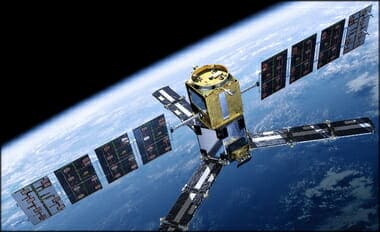
A Quick Note about the Difference between RSS and UAH TLT data
There is a noticeable difference between the RSS and UAH lower troposphere temperature anomaly data. Dr. Roy Spencer discussed this in his July 2011 blog post On the Divergence Between the UAH and RSS Global Temperature Records. In summary, John Christy and Roy Spencer believe the divergence is caused by the use of data from different satellites. UAH has used the NASA Aqua AMSU satellite in recent years, while as Dr. Spencer writes:
…RSS is still using the old NOAA-15 satellite which has a decaying orbit, to which they are then applying a diurnal cycle drift correction based upon a climate model, which does not quite match reality.
While the two lower troposphere temperature datasets are different in recent years, UAH believes their data are correct, and, likewise, RSS believes their TLT data are correct. Does the UAH data have a warming bias in recent years or does the RSS data have cooling bias? Until the two suppliers can account for and agree on the differences, both are available for presentation.
The bottom line is that those wishing to expand regulation and laws and taxes on the rest of us fudge the facts. But facts-are-facts. And the ship is sinking for these lefties.
This is meant mainly as a supplement to a Christmas Eve-Eve gathering/discussion I was at. I will make this post a little different than other posts, as, it will be “minimalist.” This is the second installment of the topics covered, which are polar bears, rising sea levels, CO2, Inconvenient Truth (the movie), nuclear power, warmest year, electric vehicles (EVs)/hybrid cars, and bullet trains.
Tarzan couldn’t take this kind of hot!
The question becomes this:
WHAT ARE THE DIFFERENT WAYS TO MEASURE TEMPERATURE,
WHICH ONE ARE MANY MEDIA SOURCES USING,
AND WHICH ARE THE MOST RELIABLE.
These are the questions any serious person who tells people 2014 is the hottest year as if they are the final arbiter of truth. I have dealt with this in the past, but will again deal with it here.
The two main research groups tracking global lower-tropospheric temperatures (our UAH group, and the Remote Sensing Systems [RSS] group) show 2014 lagging significantly behind 2010 and especially 1998:
Viewed another way:
Another instance highlighting the NOAA’s overestimating temperature is when it said October was the hottest month ever, but RSS data showed October to be ninth warmest on record. And I wonder what family members on the East-Coast would say to there being more than 400 record lows and record cool highs set, via The Weather Channel (11/2014):
A third surge of cold air pushed into the Northern Plains, Upper Midwest and East Coast. This third surge reinforced the cold temperatures for millions of Americans who have already endured at least a week of January-like chill.
There have been more than 400 record lows and record cool highs set, covering 43 states, since Sunday. That leaves only five states in the contiguous U.S., all in New England, that have not experienced record cold temperatures this week.
On Wednesday morning record lows were broken or tied from New York to Houston. Thursday morning brought more record cold to parts of the Southeast.
[….]
– First arctic surge: Spread into the East last week (November 11-15).
– Second arctic surge: Blasted through the East, Midwest, and South through early Thursday (November 16-20). For parts of the mid-Mississippi Valley, Ohio Valley, Tennessee Valley and the Middle Atlantic States, this was the coldest of the surges, with numerous daily record lows broken.
– Third arctic surge: Reached the Northern Plains and Upper Midwest Thursday, then slid east across the Great Lakes and parts of the Northeast on Friday. It did not press nearly as far south as the first and second surges did.
– Cold relief: Relief began in the Rockies, then expanded into the southern Plains and Southeast Wednesday and Thursday. Midwest and Northeast relief arrives this weekend.…
Okay, what we have already seen is that the satellite temperatures say 2014 will NOT BE the hottest year. One should ask what the hottest year was: 1934:
(L.A. Times) A slight adjustment to U.S. temperature records has bumped 1998 as the hottest year in the country’s history and made the Dust Bowl year of 1934 the new record holder, according to NASA.
[….]
That meant that 1998, which had been 0.02 degrees warmer than 1934, was now 0.04 degrees cooler.
This is where I transition to the NOAA temperature, but I wanted to take this transition with help from Dr. Willie Soon (NM), who is an Astrophysicist and Geoscientist at the Solar and Stellar Physics (SSP) Division, Harvard-Smithsonian Center for Astrophysics. (I will embolden the point made below.) More and more scientists have been coming out of the closet and Dr. Soon is one of them. He says in fact that if his community continues “to keep silent and do not express outrage like the one I now feel, the notion of science as a philosophy and way of life will soon be reduced to computer games and animation for the mind-controllers and beauty-contest institutions….” Dr. Soon continues:
2014 hottest year a manipulation
Is this a joke or simply my BAD dream? Prostituting science like this is now consider a virtue. It is no wonder that science writer Lord Ridley said that he has lost his faith on science as an institution.
Why would anyone even bother with claims and insistence of the globe in 2014 being the hottest to a relative colder years all within a few hundredths of a degree Celsius? Poor Anders Celsius should be dancing in his grave.
The claim is based on just one (from a half dozen or so) thermometer-based products whose measurement quality is fraught with uncertainty and with actual error bars at least ten times larger than those claimed “effects”.WMO and others simply pick and choose the “data” that produces the press news they want in time for the Lima, Peru political pow-wow.
In truth the datasets taken as a whole clearly show that the global temperature has been flat-trending for nearly two decades now and that the theory of rising CO2 leading to global warming is sorrowfully exaggerated.
This kind of manipulative science, exemplified by IPCC, WMO, NOAA and what have you, is serving its master in the realm of politics and policy, and is indeed very sickening.
All of them are essentially behaving in ways we would never want any of our school children to behave: cheating and manipulating that are accompanied by careful wording and clever rhetoric….
This sets us up for HOW the NOAA gets their temperatures, and why they are inaccurate. The below is posted elsewhere on my blog and is semi-technical for the layman. But the key is PLACEMENT, and you can see that in the photo’s below Dr. Mueller’s presentation on how the numbers are skewed/manipulated.
(Dr. Mueller is part of the Department of Physics at the University of California at Berkeley, and Faculty Senior Scientist at the Lawrence Berkeley Laboratory, where he is also associated with the Institute for Nuclear and Particle Astrophysics.)
ESPIONAGE
There seems to be a misunderstanding by the general public of the NOAA and other organizations and how they misuse data points (or average them wrongly).
So, for instance, professor Mueller at Berkeley mentions how climate “scientists” were hiding the decline in the past:
They were skewing the numbers in other words. This is an example of fraud. But numbers can be skewed by faulty or outdated methods/equipment. For instance,
EQUIPMENT FAIL
Here is a recent mention of the below in COMMENTARY MAGAZINE (added here 9-4-19):
…A STUDYby meteorologist Anthony Watts found that almost 90 percent of the 1221 weather stations in the U.S. did not meet the National Weather Service’s setting standards, which requires that they be at least 100 feet from any artificial heat source or radiating surface. You can see some of the most egregious violators here. To deal with this defective information, climate scientists, have “adjusted” the data to solve this problem. Invariably, these adjustments have made earlier data show lower temperatures, and recent data show higher ones.
To develop reliable data, the National Oceanic and Atmospheric Administration (NOAA) placed 114 state-of-the-art weather stations relatively evenly spaced about the lower 48 states. They were carefully sited to be away from urban areas, which are heat islands, airports, which can be affected by jet exhaust, etc.
The system became operative in 2005. Now, realclearenergy.com is reporting that there has been no increase in average temperatures in the continental United States over the last 14 years, as measured by these new stations. If anything, overall temperatures are slightly cooler than they were….
Here are some examples of fudged data because of sub-standard equipment:
You’d think the answer would be obvious, but here we have a NOAA operated USHCN climate station of record providing a live experiment. It always helps to illustrate with photos. Today I surveyed a sewage treatment plant, one of 4 stations surveyed today (though I tried for 5) and found that for convenience, they had made a nice concrete walkway to allow servicing the Fisher-Porter rain gauge, which needs a paper punch tape replaced one a month.
Here is what you see in visible light:
Here is what the infrared camera sees:
Note that the concrete surface is around 22-24°C, while the grassy areas are between 12-19°C
Class 5 (error >~= 5C) – Temperature sensor located next to/above an artificial heating source, such a building, roof top, parking lot, or concrete surface.”
More than half of the stations the NOAA use are tainted or wrongly placed equipment.
CHANGING DATA-SETS
Another example of changing averages was noted by Steve Goddard and others — even the NOAA have acknowledge it — have been discussing recently is exemplified in Dr. Judith Carry’s post on the matter (from a larger post of mine):
Even the Wall Street Journal chose the higher temperature reading to say that July of 2012 was July was the “hottest month in the contiguous U.S. since records began in 1895.” WUWT found this on accident and it has led to quite a few other revelations as we will see. Here is description in part of what we looking at:
Glaring inconsistencies found between State of the Climate (SOTC) reports sent to the press and public and the “official” climate database record for the United States. Using NCDC’s own data, July 2012 can no longer be claimed to be the “hottest month on record”.
[….]
I initially thought this was just some simple arithmetic error or reporting error, a one-off event, but then I began to find it in other months when I compared the output from the NCDC climate database plotter. Here is a table of the differences I found for the last two years between claims made in the SOTC report and the NCDC database output.
[….]
In almost every instance dating back to the inception of the CONUS Tavg value being reported in the SOTC report, there’s a difference. Some are quite significant. In most cases, the database value is cooler than the claim made in the SOTC report. Clearly, it is a systemic issue that spans over two years of reporting to the press and to the public.
It suggests that claims made by NCDC when they send out these SOTC reports aren’t credible because there are such differences between the data. Clearly, NCDC means for the plotter output they link to, to be an official representation to the public, so there cannot be a claim of me using some “not fit for purpose” method to get that data….
The WALL STREET JOURNAL made a graph showing this record setting month (below-left). The more accurate temperature for July likewise is shown in the same graph (below-right):
This looking at the data sets chosen and what is used and isn’t used to support an idea that fails in every way. Combine this obvious cherry-picking with the bias, collusion, and charges against the report that the President used to route Congress, all show we have a problem Houston! But this is only the tip of the proverbial iceberg. It seems the NOAA has been skewing these temps for some time. Why? Because the left uses this as a way to promote an ever growing government and the scientists get more-and-more funding. This data fudging story is newer, and it is evolving quickley, including this newest post via Real Science where Steve Goddard notes that More Than 40% Of USHCN Station Data Is Fabricated. Here is Dr. Judith carry’s synopsis (excerpted), in which she critiques a bit Goddard’s post… but then bows to the evidence:
OK, acknowledging that Goddard made some analysis errors, I am still left with some uneasiness about the actual data, and why it keeps changing. For example, Jennifer Marohasy has been writing about Corrupting Australian’s temperature record.
In the midst of preparing this blog post, I received an email from Anthony Watts, suggesting that I hold off on my post since there is some breaking news. Watts pointed me to a post by Paul Homewood entitled Massive Temperature Adjustments At Luling, Texas. Excerpt:
So, I thought it might be worth looking in more detail at a few stations, to see what is going on. In Steve’s post, mentioned above, he links to the USHCN Final dataset for monthly temperatures, making the point that approx 40% of these monthly readings are “estimated”, as there is no raw data.
From this dataset, I picked the one at the top of the list, (which appears to be totally random), Station number 415429, which is Luling, Texas.
Taking last year as an example, we can see that ten of the twelve months are tagged as “E”, i.e estimated. It is understandable that a station might be a month, or even two, late in reporting, but it is not conceivable that readings from last year are late. (The other two months, Jan/Feb are marked “a”, indicating missing days).
But, the mystery thickens. Each state produces a monthly and annual State Climatological Report, which among other things includes a list of monthly mean temperatures by station. If we look at the 2013 annual report for Texas, we can see these monthly temperatures for Luling.
Where an “M” appears after the temperature, this indicates some days are missing, i.e Jan, Feb, Oct and Nov. (Detailed daily data shows just one missing day’s minimum temperature for each of these months).
Yet, according to the USHCN dataset, all ten months from March to December are “Estimated”. Why, when there is full data available?
But it gets worse. The table below compares the actual station data with what USHCN describe as “the bias-adjusted temperature”. The results are shocking.
In other words, the adjustments have added an astonishing 1.35C to the annual temperature for 2013. Note also that I have included the same figures for 1934, which show that the adjustment has reduced temperatures that year by 0.91C. So, the net effect of the adjustments between 1934 and 2013 has been to add 2.26C of warming.
Note as well, that the largest adjustments are for the estimated months of March – December. This is something that Steve Goddard has been emphasising.
It is plain that these adjustments made are not justifiable in any way. It is also clear that the number of “Estimated” measurements made are not justified either, as the real data is there, present and correct.
Watts appears in the comments, stating that he has contacted John Nielsen-Gammon (Texas State Climatologist) about this issue. Nick Stokes also appears in the comments, and one commenter finds a similar problem for another Texas station.
Homewood’s post sheds light on Goddard’s original claim regarding the data drop out (not just stations that are no longer reporting, but reporting stations that are ‘estimated’). I infer from this that there seems to be a real problem with the USHCN data set, or at least with some of the stations. Maybe it is a tempest in a teacup, but it looks like something that requires NOAA’s attention. As far as I can tell, NOAA has not responded to Goddard’s allegations. Now, with Homewood’s explanation/clarification, NOAA really needs to respond….
So we see in the above, that temperatures can be changed years later as the totality of the data is included. What was considered the hottest falls to just an average month in the heat index.
And this has — within the past few months — turned into a very large debate.
EQUIPMENT FAIL II
Here is another example of older/faulty equipment:
A Quick Note about the Difference between RSS and UAH TLT data
There is a noticeable difference between the RSS and UAH lower troposphere temperature anomaly data. Dr. Roy Spencer discussed this in his July 2011 blog post On the Divergence Between the UAH and RSS Global Temperature Records. In summary, John Christy and Roy Spencer believe the divergence is caused by the use of data from different satellites. UAH has used the NASA Aqua AMSU satellite in recent years, while as Dr. Spencer writes:
…RSS is still using the old NOAA-15 satellite which has a decaying orbit, to which they are then applying a diurnal cycle drift correction based upon a climate model, which does not quite match reality.
While the two lower troposphere temperature datasets are different in recent years, UAH believes their data are correct, and, likewise, RSS believes their TLT data are correct. Does the UAH data have a warming bias in recent years or does the RSS data have cooling bias? Until the two suppliers can account for and agree on the differences, both are available for presentation.
ROSE COLORED GLASSES
Another example of competing ideas is this example from two major UK papers, the first being from the Guardian:
This next one from the Daily Mail:
(DAILY MAIL) ….The most widely used measurements of Arctic ice extent are the daily satellite readings issued by the US National Snow and Ice Data Center, which is co-funded by Nasa. These reveal that – while the long-term trend still shows a decline – last Monday, August 25, the area of the Arctic Ocean with at least 15 per cent ice cover was 5.62 million square kilometres.
This was the highest level recorded on that date since 2006 (see graph, right), and represents an increase of 1.71 million square kilometres over the past two years – an impressive 43 per cent.
Other figures from the Danish Meteorological Institute suggest that the growth has been even more dramatic. Using a different measure, the area with at least 30 per cent ice cover, these reveal a 63 per cent rise – from 2.7 million to 4.4 million square kilometres.
[….]
Crucially, the ice is also thicker, and therefore more resilient to future melting. Professor Andrew Shepherd, of Leeds University, an expert in climate satellite monitoring, said yesterday: ‘It is clear from the measurements we have collected that the Arctic sea ice has experienced a significant recovery in thickness over the past year.
‘It seems that an unusually cool summer in 2013 allowed more ice to survive through to last winter. This means that the Arctic sea ice pack is thicker and stronger than usual, and this should be taken into account when making predictions of its future extent.’
Same data used, one says BEWARE, the END IS NEAR, the other says making gains, as the graph shows below:
(So are Polar Bears, BTW) And the Antarctic has made BIG GAINS. But if the left — yes, the left — says we should renter the little ice-age to be at a normal point of “climate disruption,” then they are living a pipe-dream. As the earth gets warmer life flourishes, as warmer periods in history have exemplified:
June was ranked one of the coldest months in a while. According to the NOAA, July 2014 ranked 29th coldest out of 120using the Maximum temperature. And so we enter the discussion about if the pause is real… which is now being acknowledged by almost all (except the IPCC).
PAUSE
Here is Dr. Judith Curry posting ion the subject before getting into two papers that talk about it from two points of view:
With 39 explanations and counting, and some climate scientists now arguing that it might last yet another decade, the IPCC has sidelined itself in irrelevance until it has something serious to say about the pause and has reflected on whether its alarmism is justified, given its reliance on computer models that predicted temperature rises that have not occurred. – Rupert Darwall
The statement by Rupert Darwall concisely states what is at stake with regards to the ‘pause.’ This seriously needs to be sorted out….
For a running — updated — list of these excuses mentioned above, see here.What HAS been clearly shown is that while some wish to make CO2 illegal, CO2 is in fact not driving the climate:
GROUP-THINK
What is being shown as of late is that more-and-more scientists are becoming concerned with the group-think in the climate-sciences. Again, Dr. Judith Curry was the biggest pro-AGW proponent, but has — like many others leaders in their respective field — changed or softened her/their positions on what the science is actually showing:
The implications of dogmatic groupthink and intimidation for the pursuit of sound science — and sound policy — are chilling. – Christopher Snowden
A collection of articles from the health science community on the fate of papers and scientists that challenge the consensus.
SUN & OCEAN
Gross Scientific Negligence – IPCC Ignored Huge Body Of Peer-Reviewed Literature Showing Sun’s Clear Impact – See more at: http://tinyurl.com/kw47zcf (NASA is changing on this as well)
NASA is saying the sun — thanks to the Goddard Institute studying this, is the driver of warming and cooling: http://tinyurl.com/m29yo99 (Via Hockey Shtick)
And yet another study is showing the sun as the major player… NOT greenhouse gases.
So what’s the bottom line? NOAA temps change over time. Many in this respective field are seeing group-think. Ideology is driving this group-think, not science.
Why should you be interested? Sea surface temperature records indicate El Niño and La Niña events are responsible for the warming of global sea surface temperature anomalies over the past 30 years, not man-made greenhouse gases. I’ve searched sea surface temperature records for more than 4 years and ocean heat content records for more than 3 years, and I can find no evidence of an anthropogenic greenhouse gas signal in either dataset. That is, the warming of the global oceans has been caused by naturally occurring, sunlight-fueled, coupled ocean-atmosphere processes, not anthropogenic greenhouse gases.
No matter what evidences one puts forward, until people remove their rose-colored glasses, they will continue to explain away the pause showing CO2 has nothing to do with global temperatures.