For some reason the original uploads are in two parts, I combined them… the resolution is bad so I merely shrunk it as the main ideas are still sound:
(From the original video description) Anthony Watts is as interesting a person as you will meet in a lifetime. It was my pleasure to have him come to our KUSI News studio for an interview for my recent “Global Warming: Meltdown” program. Not only did I interview him, but most importantly, he presented his entire SURFACESTATIONS.ORG Powerpoint presentation as an answer to my second question. Anthony Watts is an American broadcast weather presenter (AMS sealholder retired), editor of the blog “Watts Up With That?”, owner of the weather graphics company It Works, and founder of the SurfaceStations.org project that documents the siting of weather stations across the United States. He is a meteorologist for KPAY-AM radio. (Part 1: https://youtu.be/ZzLNQV3dmcI | Part 2: https://youtu.be/x8vlFZlFWKw)
Here is a recent mention of the below in COMMENTARY MAGAZINE (added here 9-4-19, emphasis added here):
…A STUDYby meteorologist Anthony Watts found that almost 90 percent of the 1221 weather stations in the U.S. did not meet the National Weather Service’s setting standards, which requires that they be at least 100 feet from any artificial heat source or radiating surface. You can see some of the most egregious violators HERE. To deal with this defective information, climate scientists, have “adjusted” the data to solve this problem. Invariably, these adjustments have made earlier data show lower temperatures, and recent data show higher ones.
To develop reliable data, the National Oceanic and Atmospheric Administration (NOAA) placed 114 state-of-the-art weather stations relatively evenly spaced about the lower 48 states. They were carefully sited to be away from urban areas, which are heat islands, airports, which can be affected by jet exhaust, etc.
The system became operative in 2005. Now, realclearenergy.com is REPORTING that there has been no increase in average temperatures in the continental United States over the last 14 years, as measured by these new stations. If anything, overall temperatures are slightly cooler than they were….
Here are some examples of fudged data because of sub-standard equipment:
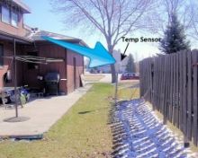
You’d think the answer would be obvious, but here we have a NOAA operated USHCN climate station of record providing a live experiment. It always helps to illustrate with photos. Today I surveyed a sewage treatment plant, one of 4 stations surveyed today (though I tried for 5) and found that for convenience, they had made a nice concrete walkway to allow servicing the Fisher-Porter rain gauge, which needs a paper punch tape replaced one a month.
Here is what you see in visible light:
Here is what the infrared camera sees:
Note that the concrete surface is around 22-24°C, while the grassy areas are between 12-19°C
Class 5 (error >~= 5C) – Temperature sensor located next to/above an artificial heating source, such a building, roof top, parking lot, or concrete surface.”
More than half of the stations the NOAA use are tainted or wrongly placed equipment.
During the great heatwave of July, 2016 – temperatures in Ada, Minnesota averaged 16 degrees cooler than during July, 1936… Aurora, Illinois was about 13 degrees warmer in 1936… Same story in Bloomington, Indiana. (The Deplorable Climate Science Blog)
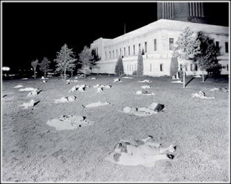
Residents of Lincoln, Nebraska spend the night on the lawn of the state capital on July 25, 1936. The temperature that night never fell below 91°, perhaps the warmest night ever recorded anywhere in the United States outside of the desert Southwest.
NOAA has found it necessary to monkey with July temperatures by 1,000% in order to note that 2016 is the hottest July on record. (Ditto)
In 1924 the outback Australian town of Marble Bar recorded the longest ever heatwave, setting a record for the most consecutive days above 100F (37.8C). In 1976 the United Kingdom sweltered in temperatures exceeding 90F (32.2C) for 15 consecutive days. A further five days saw temperatures reaching 95F (35C). Parts of the country’s southwest went for 45 days without rain, prompting terrible heath and forest fires that destroyed trees and crops. The heatwave came to a dramatic end in August, with severe thunderstorms rolling across the country.
More accurate measurements of the lower troposphere show that July was nowhere near as warm as 1998 and 2010.
This is why REAL SCIENCE notes that for Gavin A. Schmidt (of NASA) to say July is the hottest month on record is this most PROVABLY fraudulent statement yet.
The touting of all these “hottest years” and scare tactics and the U.N. saying rising oceans will threaten the Statue of Liberty, are all power grabs. Period. The EPA says their most strict legislative acts to implement new regulations that will fight global warming, are ALSO A LIE! Like the Arctic for years being prophesied to be ice-free, and in fact setting ice-expansion records during month it was suppose to be ice-free.
Environmental Protection Agency Administrator Gina McCarthy admitted her agency’s signature regulation aimed at tackling global warming was meant to show “leadership” rather than actually curb projected warming.
McCarthy admitted as much after being questioned by West Virginia Republican Rep. David McKinley, who pressed the EPA chief on why the Obama administration was moving forward with economically-damaging regulations that do nothing for the environment.
“I don’t understand,” McKinley said in a Tuesday hearing. “If it doesn’t have an impact on climate change around the world, why are we subjecting our hard working taxpayers and men and women in the coal fields to something that has no benefit?”…
Here is a great presentation showing the EPA to be full of B.S. Former Obama Department of Energy Assistant Secretary Charles McConnell eviscerates the President’s proposed Clean Power Plan regulation to fight global warming in testimony before Congress:
I said out-loud “AMEN” to the line, “I am no lawyer, but I AM a citizen!”
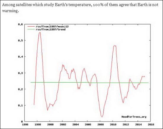
We know in order to get the temperatures NASA and NOAA wish to promote…. they do not use the data from satellites when they state such things as 2015 was the warmest year on record. Whereas a 100% of satellites agree that temperature has been steady, a 100% of the modeling has been wrong.
Instead, they use readings from places like these that they can then add an addition algorythm to to “fix” the data:
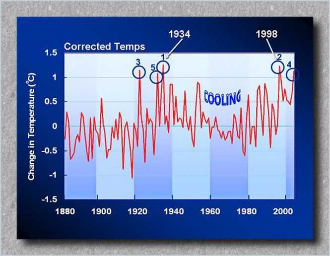
In fact, since NASA/NOAA changed the temps due to McIntyre’s work, had the hottest years listed as: 1998, 1934, 2006, 1921 and 1931. NASA then changed them to…
1934, 1998, 1921, 2006 and then 1931;
then again to, 1998, 2006, 1934, 1921, 1999.
These government, taxpayer associations that should make data for such “corrections” available to the public representatives, instead, they refused to hand over what should have been easy info to give. This obfuscation by these public institutions are summed up well by McIntyre:
…“Fixing” bad data with software is by no means an easy thing to do (as witness Mann’s unreported modification of principal components methodology on tree ring networks.) The GISS adjustment schemes (despite protestations from Schmidt that they are “clearly outlined”) are not at all easy to replicate using the existing opaque descriptions. For example, there is nothing in the methodological description that hints at the change in data provenance before and after 2000 that caused the Hansen error. Because many sites are affected by climate change, a general urban heat island effect and local microsite changes, adjustment for heat island effects and local microsite changes raises some complicated statistical questions, that are nowhere discussed in the underlying references (Hansen et al 1999, 2001). In particular, the adjustment methods are not techniques that can be looked up in statistical literature, where their properties and biases might be discerned. They are rather ad hoc and local techniques that may or may not be equal to the task of “fixing” the bad data.
Making readers run the gauntlet of trying to guess the precise data sets and precise methodologies obviously makes it very difficult to achieve any assessment of the statistical properties. In order to test the GISS adjustments, I requested that GISS provide me with details on their adjustment code. They refused. Nevertheless, there are enough different versions of U.S. station data (USHCN raw, USHCN time-of-observation adjusted, USHCN adjusted, GHCN raw, GHCN adjusted) that one can compare GISS raw and GISS adjusted data to other versions to get some idea of what they did….
He then goes on to explain the lack of detail from the GISS numbers via the U.S. compared to the global temps:
…These differences are attributed to “regional” differences and it is quite possible that this is a complete explanation. However, this conclusion is complicated by a number of important methodological differences between the U.S. and the ROW. In the U.S., despite the criticisms being rendered at surfacestations.org, there are many rural stations that have been in existence over a relatively long period of time; while one may cavil at how NOAA and/or GISS have carried out adjustments, they have collected metadata for many stations and made a concerted effort to adjust for such metadata. On the other hand, many of the stations in China, Indonesia, Brazil and elsewhere are in urban areas (such as Shanghai or Beijing). In some of the major indexes (CRU,NOAA), there appears to be no attempt whatever to adjust for urbanization. GISS does report an effort to adjust for urbanization in some cases, but their ability to do so depends on the existence of nearby rural stations, which are not always available. Thus, ithere is a real concern that the need for urban adjustment is most severe in the very areas where adjustments are either not made or not accurately made.
In its consideration of possible urbanization and/or microsite effects, IPCC has taken the position that urban effects are negligible, relying on a very few studies (Jones et al 1990, Peterson et al 2003, Parker 2005, 2006), each of which has been discussed at length at this site. In my opinion, none of these studies can be relied on for concluding that urbanization impacts have been avoided in the ROW sites contributing to the overall history….
According to data on the NOAA website, 1997 was truly the hottest year on record at 62.45 oF. The average global temperature in 2015 was 58.62 oF or 3.83 oF below the 1997 temperature.
According to data on the NOAA website, the temperatures such as the 20thcentury average temperature and annual temperature anomalies, which must be fixed, have different values in the annual global analyses.
NOAA and NASA corrected historical temperature data and fabricated temperature data in areas without temperature record systematically, widely, and uni-directionally to “cool” the past in an attempt to prove the soaring temperature trend.
NOAA and NASA made efforts to discredit their own satellite data – which is consistent with the balloon data – because it suggests a global warming hiatus since 1998 contradicting with the NOAA and NASA preferred narrative.
NOAA and NASA refused to give data and information requested by the US House of Representatives Science, Space and Technology committee. There is no reason for them to withhold the data and information, which are public domain, unless they have something to hide.
This caused people to wonder if NASA/NOAA were doing the same thing as the Europeans had been caught doing. So the requests for the records started being made. Here is the WASHINGTON TIMES talking about it in 2009:
…The center’s chief has stepped down pending an investigation into the e-mails.
The center has also had to acknowledge in response to a freedom of information request under British law that it tossed out much of the raw data that it used to draw up the temperature models that have underpinned much of the science behind global warming.
Mr. Horner suspects the same sort of data-shaving has happened at NASA’s Goddard Institute for Space Studies (GISS), another leading global warming research center.
Mark Hess, public affairs director for the Goddard Space Flight Center which runs the GISS laboratory, said they are working on Mr. Horner’s request, though he couldn’t say why they have taken so long.
[….]
NASA’s GISS was forced to update its data in 2007 after questions were raised by Steve McIntyre, who runs ClimateAudit.com.
GISS had initially listed the warmest years as 1998, 1934, 2006, 1921 and 1931. After Mr. McIntyre’s questions GISS rejiggered the list and 1934 was warmest, followed by 1998, 1921, 2006 and then 1931. But since then, the list has been rewritten again so it now runs 1998, 2006, 1934, 1921, 1999.
The institute blamed a “minor data processing error” for the changes but says it doesn’t make much difference since the top three years remain in a “statistical tie” either way.
Mr. Horner said he’s seeking the data itself, but he also wants to see the chain of e-mails from scientists discussing the changes.
The Freedom of Information Act requires agencies to respond to requests within 20 days. Mr. Horner says he’s never received an official acknowledgement of his three separate FOIA requests, but has received e-mails showing the agency is aware of them.
He said he has provided NASA with a notice of intent to sue under FOIA, but said he also hopes members of Congress get involved and demand the information be released.
NASA and CRU data are considered the backbone of much of the science that suggests the earth is warming due to manmade greenhouse gas emissions. NASA argues its data suggests this decade has been the warmest on record.
On the other hand, data from the University of Alabama-Huntsville suggests temperatures have been relatively flat for most of this decade.
In fact, JUDICIAL WATCH has had to get involved as of late 2015:
…Judicial Watch sued the Department of Commerce after the agency failed to respond to a Freedom of Information Act (FOIA) request submitted on October 30, 2015 – NOAA is a component of the Department of Commerce. The timeframe for the requested records is October 30, 2014, through October 30, 2015, and requests all documents and records of communications between NOAA officials, employees, and contractors regarding:
The methodology and utilization of night marine air temperatures to adjust ship and buoy temperature data;
The use of other global temperature datasets for both NOAA’s in-house dataset improvements and monthly press releases conveying information to the public about global temperatures;
The utilization and consideration of satellite bulk atmospheric temperature readings for use in global temperature datasets; and
A subpoena issued for the aforementioned information by Congressman Lamar Smith on October 13, 2015.
[….]
On November 26, Smith published an opinion editorial in The Washington Times, which accused NOAA of tampering with data to help promote global warming alarmism:
NOAA often fails to consider all available data in its determinations and climate change reports to the public. A recent study by NOAA, published in the journal Science, made “adjustments” to historical temperature records and NOAA trumpeted the findings as refuting the nearly two-decade pause in global warming. The study’s authors claimed these adjustments were supposedly based on new data and new methodology. But the study failed to include satellite data.
“We have little doubt that our lawsuit helped to pry these scandalous climate change report documents from the Obama administration. The Obama administration seems to care not one whit for a congressional subpoena but knows from prior experience that a Judicial Watch FOIA lawsuit cannot be ignored,” said Judicial Watch President Tom Fitton. “Given the lawless refusal to comply with our FOIA request and a congressional subpoena, we have little doubt that the documents will show the Obama administration put politics before science to advance global warming alarmism.”
Judicial Watch previously investigated alleged data manipulation by global warming advocates in the Obama administration. In 2010, Judicial Watch obtained internal documents from NASA’s Goddard Institute for Space Studies (GISS) related to a controversy that erupted in 2007 when Canadian blogger Stephen McIntyre exposed an error in NASA’s handling of raw temperature data from 2000-2006 that exaggerated the reported rise in temperature readings in the United States. According to multiple press reports, when NASA corrected the error, the new data apparently caused a reshuffling of NASA’s rankings for the hottest years on record in the United States, with 1934 replacing 1998 at the top of the list….
I have a feeling this will end badly for NASA/NOAA. Why do I say that? Because if they have nothing to hide then there is no reason for them to withhold the data and information, which are public domain.
…The documents revealed a “new climate data scandal,” Judicial Watch said in announcing the suit.
“Information provided to the committee by whistleblowers appears to show that the study was rushed to publication despite the concerns and objections of a number of NOAA employees,” according to the committee.
The Texas Republican also noted that a recent NOAA study made adjustments to historical temperature records, which led the findings to refute a nearly two-decade pause to global warming….
This post will be an extended rebuttal to a portion of a much longer discussion. It is in response to the cartoonists website, SKEPTICAL SCIENCE, which has been responded to in a manner that should undermine it’s validity. But alas, it does not. So first let me post the graphic that caused the person to run to this propaganda site for a rebuttal:
The year 1934 was a very hot year in the United States, ranking fourth behind 2012, 2006, and 1998. However, global warming takes into account temperatures over the entire planet. The U.S.’s land area accounts for only 2% of the earth’s total surface area. Despite the U.S. heat in 1934, the year was not so hot over the rest of the planet, and is barely holding onto a place in the hottest 50 years in the global rankings (today it ranks 49th).
There are some preliminary thoughts on this before we get into the “nitty gritty.” First, in 1933-1936 (the heat wave and wild weather span), how many countries or persons were recording weather and temperature anomalies? Common sense says that of course, not nearly as much as today. We only started measuring with satellites since 1979. Another head-tilter would be have or did the NOAA or NASA previously note other years as warmer — in the past? We will find this out as we go along.
As you read this stuff (follow links to stories, and the like), that some sites just use the basic data without correcting it. I will discuss this later in the post… but first and foremost, are there reports from those years showing temperature and weather anomalies from around the world? Yes. Here is some evidences:
Mind you, this is a small sampling from THE NO TRICKS ZONE, many more examples can be found at C3 HEADLINES, as well as a site documenting the United Kingdom’s weather for some years. So it seems that we are looking at a few year GLOBAL weather pattern. AGAIN, we did not have satellites then so we can rely on eyewitness accounts such as these.
However, I wanted to comment on some of the wrong data being used or fudged data to make climate look worse now than in the past. I have to thank the person I was discussing the issue with, because he had posted a story linked to the journal, Nature. All it had was an abstract, and while I am a member of the AAAS, the Nature journal subscription was too much. There were also a list of corrections, so I asked him for either a full article and/or some links to the corrections. Lo-and-behold he gave me a link of a corrected graph that worked in my favor:
The red area is what concerns me… but even with it is has been warmer in the past (to note the bottom line). A professor at Berkeley notes that there is a collusion between some to hide the data that counters the narrative from the “warmists.” Mind you, the following video is for 2014, but I will make a point afterwords:
MRCTV BLOG notes the following that will throw a stone into the shoe of the left about 2015 being the hottest year. Remember, the internet never forgets!
…To explain where NOAA messed up, we have to start with 1997.
In that 1997 report, they say clearly that the Global Average Temperature (GAT) was 62.45°F, based on a 30-year average (1961-1990) of the combined land and sea surface temperatures. Since we know the 1997 El Nino caused a record high spike in temperature, that means that for that 30 year period, there was no warmer GAT than 62.45°F up until that time.
Now, back to 2015. The recently released NOAA report, claiming that 2015 was the hottest year ever, says:
During 2015, the average temperature across global land and ocean surfaceswas 1.62°F (0.90°C) above the 20th century average. This was the highest among all 136 years in the 1880–2015 record, surpassing the previous record set last year by 0.29°F (0.16°C) and marking the fourth time a global temperature record has been set this century.
It was blogger Wattsupwiththat who first noticed and explained the funky math. He explains that the recent report compares 2015 to the 20th century average – but, doesn’t mention what that average temperature was.
However, it does give a 20th Century average in its November 2015 State of the Climate Report: – 13.9 degrees Celsius (57 degrees Fahrenheit):
Now, it’s math time:
According to NOAA, the global average temperature for the 20th century was 57 degrees Fahrenheit.
And the 2015 average was 1.62 degrees Fahrenheit above that average.
In other words, according to this recent NOAA report, 2015 was the hottest year ever at 58.62 degrees Fahrenheit (57+1.62).
And, that 1997 NOAA report states 1997 had an average global temperature of 62.45 degrees.
….According to my calculator:
1997’s 62.45 degrees is 3.83 degrees Fahrenheit higher than 2015’s 58.62 degrees Fahrenheit, meaning that – using NOAA’s own numbers – 2015 cannot be the hottest year on record.
As suggested monthly by the mainstream media since April 2015, NOAA and NASA officially declared that 2015 surpassed the 2014 record to become the new hottest year on record and that 2016 could be hotter than 2015! The average global temperatures calculated by NOAA and NASA, however, appear to be inaccurate and unreliable for the following reasons:
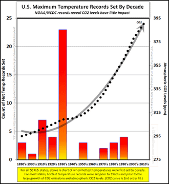
In Table 2, we’ve compiled the top five years when the most records were set. When multiple years tie for the high, each individual year gets a fraction of a “record”. So, for example, 1954 and 1933 each get a half of a record for Colorado.
According to data on the NOAA website, 1997 was truly the hottest year on record at 62.45 oF. The average global temperature in 2015 was 58.62 oF or 3.83 oF below the 1997 temperature.
According to data on the NOAA website, the temperatures such as the 20th century average temperature and annual temperature anomalies, which must be fixed, have different values in the annual global analyses.
NOAA and NASA corrected historical temperature data and fabricated temperature data in areas without temperature record systematically, widely, and uni-directionally to “cool” the past in an attempt to prove the soaring temperature trend.
NOAA and NASA made efforts to discredit their own satellite data – which is consistent with the balloon data – because it suggests a global warming hiatus since 1998 contradicting with the NOAA and NASA preferred narrative.
NOAA and NASA refused to give data and information requested by the US House of Representatives Science, Space and Technology committee. There is no reason for them to withhold the data and information, which are public domain, unless they have something to hide.
The headline “last year was the hottest year on record, this year is hotter than last year, and next year could be hotter than this year” is likely to be repeated years after years until funding for climate change is stopped!
The National Center for Policy Analysis, mentions a change a few years back:
The warmest year on record is no longer 1998 and not because it has been overtaken by a recent heat wave. National Aeronautics and Space Administration (NASA) scientist James Hansen’s famous claims about 1998 being the warmest year on record in the United States was the result of a serious math error, according to H. Sterling Burnett, a senior fellow at the National Center for Policy Analysis (NCPA).
According to NASA’s newly published data:
The hottest year on record is 1934, not 1998.
The third hottest year on record was 1921, not 2006.
Three of the five hottest years on record occurred before 1940.
Six of the top 10 hottest years occurred before 90 percent of the growth in greenhouse gas emissions during the last century occurred.
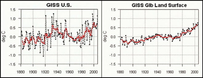
Here we see raw data vs. messaged data run through a hopper. In 2007 NASA adjusted it’s U.S. findings to match the real data:
The measured USHCN daily temperature data shows a decline in US temperatures since the 1930s. But before they release it to the public, they put it thorough a series of adjustments which change it from a cooling trend to a warming trend.
[….]
The next blink comparator shows changes in the US temperature record from GISS. It alternates between their 1999 graph and the 2012 version of the same graph. The past is cooled and the present is warmed.
Here are some examples of fudged data because of sub-standard equipment:
You’d think the answer would be obvious, but here we have a NOAA operated USHCN climate station of record providing a live experiment. It always helps to illustrate with photos. Today I surveyed a sewage treatment plant, one of 4 stations surveyed today (though I tried for 5) and found that for convenience, they had made a nice concrete walkway to allow servicing the Fisher-Porter rain gauge, which needs a paper punch tape replaced one a month.
Here is what you see in visible light:
Here is what the infrared camera sees:
Note that the concrete surface is around 22-24°C, while the grassy areas are between 12-19°C
Class 5 (error >~= 5C) – Temperature sensor located next to/above an artificial heating source, such a building, roof top, parking lot, or concrete surface.”
More than half of the stations the NOAA use are tainted or wrongly placed equipment. Here is an example of a well maintained station with data sets:
Here is data sets corresponding to a site where heat corrupts the data:
Here are even more corrupt examples of these stations placed next to air conditioner outlets, next to burners, next to lights that glow at night, asphalt surrounding them and buildings that radiate heat as well as block wind (NOTE this continually growing accumulation of these sites at WUWT):
CHANGING DATA-SETS
Another example of changing averages was noted by Steve Goddard and others — even the NOAA have acknowledge it — have been discussing recently is exemplified in Dr. Judith Carry’s post on the matter (from a larger post of mine):
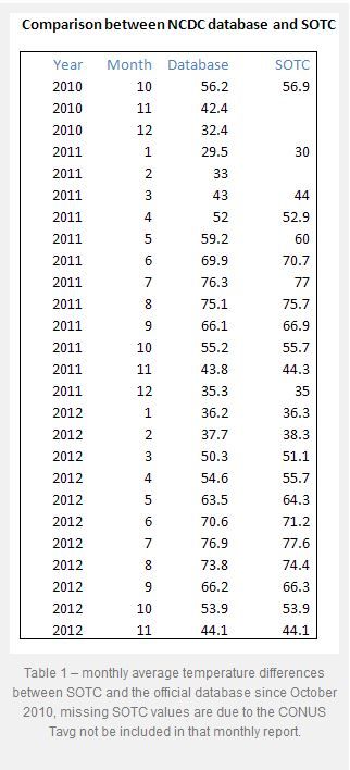
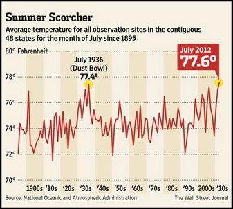
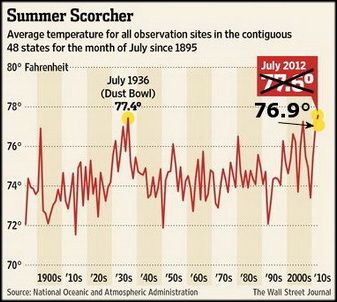
Even the Wall Street Journal chose the higher temperature reading to say that July of 2012 was July was the “hottest month in the contiguous U.S. since records began in 1895.” WUWT found this on accident and it has led to quite a few other revelations as we will see. Here is description in part of what we looking at:
Glaring inconsistencies found between State of the Climate (SOTC) reports sent to the press and public and the “official” climate database record for the United States. Using NCDC’s own data, July 2012 can no longer be claimed to be the “hottest month on record”.
[….]
I initially thought this was just some simple arithmetic error or reporting error, a one-off event, but then I began to find it in other months when I compared the output from the NCDC climate database plotter. Here is a table of the differences I found for the last two years between claims made in the SOTC report and the NCDC database output.
[….]
In almost every instance dating back to the inception of the CONUS Tavg value being reported in the SOTC report, there’s a difference. Some are quite significant. In most cases, the database value is cooler than the claim made in the SOTC report. Clearly, it is a systemic issue that spans over two years of reporting to the press and to the public.
It suggests that claims made by NCDC when they send out these SOTC reports aren’t credible because there are such differences between the data. Clearly, NCDC means for the plotter output they link to, to be an official representation to the public, so there cannot be a claim of me using some “not fit for purpose” method to get that data….
The Wall Street Journal made a graph showing this record setting month (below-left). The more accurate temperature for July likewise is shown in the same graph (below-right):
This looking at the data sets chosen and what is used and isn’t used to support an idea that fails in every way. Combine this obvious cherry-picking with the bias, collusion, and charges against the report that the President used to route Congress, all show we have a problem Houston! But this is only the tip of the proverbial iceberg. It seems the NOAA has been skewing these temps for some time. Why? Because the left uses this as a way to promote an ever growing government and the scientists get more-and-more funding. This data fudging story is newer, and it is evolving quickley, including this newest post via Real Science where Steve Goddard notes that More Than 40% Of USHCN Station Data Is Fabricated. Here is Dr. Judith carry’s synopsis (excerpted), in which she critiques a bit Goddard’s post… but then bows to the evidence:
OK, acknowledging that Goddard made some analysis errors, I am still left with some uneasiness about the actual data, and why it keeps changing. For example, Jennifer Marohasy has been writing about Corrupting Australian’s temperature record.
In the midst of preparing this blog post, I received an email from Anthony Watts, suggesting that I hold off on my post since there is some breaking news. Watts pointed me to a post by Paul Homewood entitled Massive Temperature Adjustments At Luling, Texas. Excerpt:
So, I thought it might be worth looking in more detail at a few stations, to see what is going on. In Steve’s post, mentioned above, he links to the USHCN Final dataset for monthly temperatures, making the point that approx 40% of these monthly readings are “estimated”, as there is no raw data.
From this dataset, I picked the one at the top of the list, (which appears to be totally random), Station number 415429, which is Luling, Texas.
Taking last year as an example, we can see that ten of the twelve months are tagged as “E”, i.e estimated. It is understandable that a station might be a month, or even two, late in reporting, but it is not conceivable that readings from last year are late. (The other two months, Jan/Feb are marked “a”, indicating missing days).
But, the mystery thickens. Each state produces a monthly and annual State Climatological Report, which among other things includes a list of monthly mean temperatures by station. If we look at the 2013 annual report for Texas, we can see these monthly temperatures for Luling.
Where an “M” appears after the temperature, this indicates some days are missing, i.e Jan, Feb, Oct and Nov. (Detailed daily data shows just one missing day’s minimum temperature for each of these months).
Yet, according to the USHCN dataset, all ten months from March to December are “Estimated”. Why, when there is full data available?
But it gets worse. The table below compares the actual station data with what USHCN describe as “the bias-adjusted temperature”. The results are shocking.
In other words, the adjustments have added an astonishing 1.35C to the annual temperature for 2013. Note also that I have included the same figures for 1934, which show that the adjustment has reduced temperatures that year by 0.91C. So, the net effect of the adjustments between 1934 and 2013 has been to add 2.26C of warming.
Note as well, that the largest adjustments are for the estimated months of March – December. This is something that Steve Goddard has been emphasising.
It is plain that these adjustments made are not justifiable in any way. It is also clear that the number of “Estimated” measurements made are not justified either, as the real data is there, present and correct.
Watts appears in the comments, stating that he has contacted John Nielsen-Gammon (Texas State Climatologist) about this issue. Nick Stokes also appears in the comments, and one commenter finds a similar problem for another Texas station.
Homewood’s post sheds light on Goddard’s original claim regarding the data drop out (not just stations that are no longer reporting, but reporting stations that are ‘estimated’). I infer from this that there seems to be a real problem with the USHCN data set, or at least with some of the stations. Maybe it is a tempest in a teacup, but it looks like something that requires NOAA’s attention. As far as I can tell, NOAA has not responded to Goddard’s allegations. Now, with Homewood’s explanation/clarification, NOAA really needs to respond….
So we see in the above, that temperatures can be changed years later as the totality of the data is included. What was considered the hottest falls to just an average month in the heat index.
And this has — within the past few months — turned into a very large debate.
EQUIPMENT FAIL II
Here is another example of older/faulty equipment:
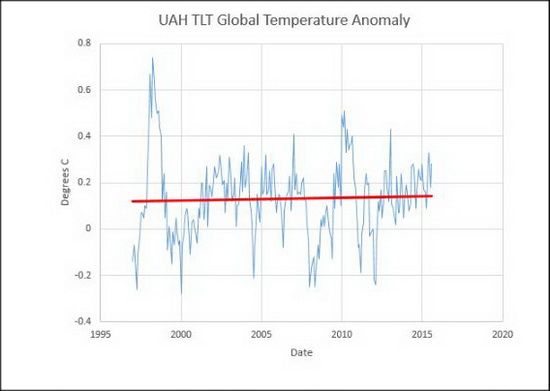
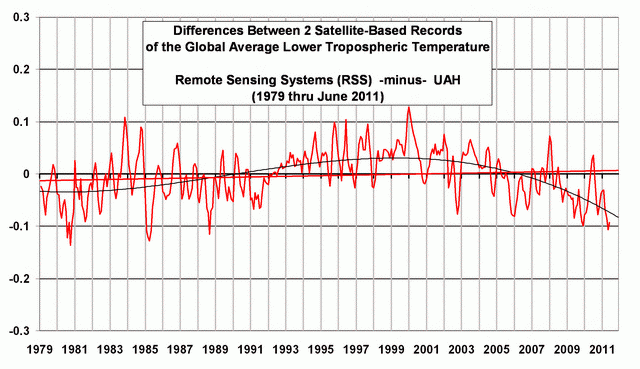
A Quick Note about the Difference between RSS and UAH TLT data
There is a noticeable difference between the RSS and UAH lower troposphere temperature anomaly data. Dr. Roy Spencer discussed this in his July 2011 blog post On the Divergence Between the UAH and RSS Global Temperature Records. In summary, John Christy and Roy Spencer believe the divergence is caused by the use of data from different satellites. UAH has used the NASA Aqua AMSU satellite in recent years, while as Dr. Spencer writes:
…RSS is still using the old NOAA-15 satellite which has a decaying orbit, to which they are then applying a diurnal cycle drift correction based upon a climate model, which does not quite match reality.
While the two lower troposphere temperature datasets are different in recent years, UAH believes their data are correct, and, likewise, RSS believes their TLT data are correct. Does the UAH data have a warming bias in recent years or does the RSS data have cooling bias? Until the two suppliers can account for and agree on the differences, both are available for presentation.
The bottom line is that those wishing to expand regulation and laws and taxes on the rest of us fudge the facts. But facts-are-facts. And the ship is sinking for these lefties.
Here are some examples of fudged data because of sub-standard equipment:
You’d think the answer would be obvious, but here we have a NOAA operated USHCN climate station of record providing a live experiment. It always helps to illustrate with photos. Today I surveyed a sewage treatment plant, one of 4 stations surveyed today (though I tried for 5) and found that for convenience, they had made a nice concrete walkway to allow servicing the Fisher-Porter rain gauge, which needs a paper punch tape replaced one a month.
Here is what you see in visible light:
Here is what the infrared camera sees:
Note that the concrete surface is around 22-24°C, while the grassy areas are between 12-19°C
Class 5 (error >~= 5C) – Temperature sensor located next to/above an artificial heating source, such a building, roof top, parking lot, or concrete surface.”
More than half of the stations the NOAA use are tainted or wrongly placed equipment.
CHANGING DATA-SETS
Another example of changing averages was noted by Steve Goddard and others — even the NOAA have acknowledge it — have been discussing recently is exemplified in Dr. Judith Carry’s post on the matter (from a larger post of mine):
Even the Wall Street Journal chose the higher temperature reading to say that July of 2012 was July was the “hottest month in the contiguous U.S. since records began in 1895.” WUWT found this on accident and it has led to quite a few other revelations as we will see. Here is description in part of what we looking at:
Glaring inconsistencies found between State of the Climate (SOTC) reports sent to the press and public and the “official” climate database record for the United States. Using NCDC’s own data, July 2012 can no longer be claimed to be the “hottest month on record”.
[….]
I initially thought this was just some simple arithmetic error or reporting error, a one-off event, but then I began to find it in other months when I compared the output from the NCDC climate database plotter. Here is a table of the differences I found for the last two years between claims made in the SOTC report and the NCDC database output.
[….]
In almost every instance dating back to the inception of the CONUS Tavg value being reported in the SOTC report, there’s a difference. Some are quite significant. In most cases, the database value is cooler than the claim made in the SOTC report. Clearly, it is a systemic issue that spans over two years of reporting to the press and to the public.
It suggests that claims made by NCDC when they send out these SOTC reports aren’t credible because there are such differences between the data. Clearly, NCDC means for the plotter output they link to, to be an official representation to the public, so there cannot be a claim of me using some “not fit for purpose” method to get that data….
The Wall Street Journal made a graph showing this record setting month (below-left). The more accurate temperature for July likewise is shown in the same graph (below-right):
This looking at the data sets chosen and what is used and isn’t used to support an idea that fails in every way. Combine this obvious cherry-picking with the bias, collusion, and charges against the report that the President used to route Congress, all show we have a problem Houston! But this is only the tip of the proverbial iceberg. It seems the NOAA has been skewing these temps for some time. Why? Because the left uses this as a way to promote an ever growing government and the scientists get more-and-more funding. This data fudging story is newer, and it is evolving quickley, including this newest post via Real Science where Steve Goddard notes that More Than 40% Of USHCN Station Data Is Fabricated. Here is Dr. Judith carry’s synopsis (excerpted), in which she critiques a bit Goddard’s post… but then bows to the evidence:
OK, acknowledging that Goddard made some analysis errors, I am still left with some uneasiness about the actual data, and why it keeps changing. For example, Jennifer Marohasy has been writing about Corrupting Australian’s temperature record.
In the midst of preparing this blog post, I received an email from Anthony Watts, suggesting that I hold off on my post since there is some breaking news. Watts pointed me to a post by Paul Homewood entitled Massive Temperature Adjustments At Luling, Texas. Excerpt:
So, I thought it might be worth looking in more detail at a few stations, to see what is going on. In Steve’s post, mentioned above, he links to the USHCN Final dataset for monthly temperatures, making the point that approx 40% of these monthly readings are “estimated”, as there is no raw data.
From this dataset, I picked the one at the top of the list, (which appears to be totally random), Station number 415429, which is Luling, Texas.
Taking last year as an example, we can see that ten of the twelve months are tagged as “E”, i.e estimated. It is understandable that a station might be a month, or even two, late in reporting, but it is not conceivable that readings from last year are late. (The other two months, Jan/Feb are marked “a”, indicating missing days).
But, the mystery thickens. Each state produces a monthly and annual State Climatological Report, which among other things includes a list of monthly mean temperatures by station. If we look at the 2013 annual report for Texas, we can see these monthly temperatures for Luling.
Where an “M” appears after the temperature, this indicates some days are missing, i.e Jan, Feb, Oct and Nov. (Detailed daily data shows just one missing day’s minimum temperature for each of these months).
Yet, according to the USHCN dataset, all ten months from March to December are “Estimated”. Why, when there is full data available?
But it gets worse. The table below compares the actual station data with what USHCN describe as “the bias-adjusted temperature”. The results are shocking.
In other words, the adjustments have added an astonishing 1.35C to the annual temperature for 2013. Note also that I have included the same figures for 1934, which show that the adjustment has reduced temperatures that year by 0.91C. So, the net effect of the adjustments between 1934 and 2013 has been to add 2.26C of warming.
Note as well, that the largest adjustments are for the estimated months of March – December. This is something that Steve Goddard has been emphasising.
It is plain that these adjustments made are not justifiable in any way. It is also clear that the number of “Estimated” measurements made are not justified either, as the real data is there, present and correct.
Watts appears in the comments, stating that he has contacted John Nielsen-Gammon (Texas State Climatologist) about this issue. Nick Stokes also appears in the comments, and one commenter finds a similar problem for another Texas station.
Homewood’s post sheds light on Goddard’s original claim regarding the data drop out (not just stations that are no longer reporting, but reporting stations that are ‘estimated’). I infer from this that there seems to be a real problem with the USHCN data set, or at least with some of the stations. Maybe it is a tempest in a teacup, but it looks like something that requires NOAA’s attention. As far as I can tell, NOAA has not responded to Goddard’s allegations. Now, with Homewood’s explanation/clarification, NOAA really needs to respond….
So we see in the above, that temperatures can be changed years later as the totality of the data is included. What was considered the hottest falls to just an average month in the heat index.
And this has — within the past few months — turned into a very large debate.
EQUIPMENT FAIL II
Here is another example of older/faulty equipment:
A Quick Note about the Difference between RSS and UAH TLT data
There is a noticeable difference between the RSS and UAH lower troposphere temperature anomaly data. Dr. Roy Spencer discussed this in his July 2011 blog post On the Divergence Between the UAH and RSS Global Temperature Records. In summary, John Christy and Roy Spencer believe the divergence is caused by the use of data from different satellites. UAH has used the NASA Aqua AMSU satellite in recent years, while as Dr. Spencer writes:
…RSS is still using the old NOAA-15 satellite which has a decaying orbit, to which they are then applying a diurnal cycle drift correction based upon a climate model, which does not quite match reality.
While the two lower troposphere temperature datasets are different in recent years, UAH believes their data are correct, and, likewise, RSS believes their TLT data are correct. Does the UAH data have a warming bias in recent years or does the RSS data have cooling bias? Until the two suppliers can account for and agree on the differences, both are available for presentation.
Data from America’s most advanced climate monitoring system shows the U.S. has undergone a cooling trend over the last decade, despite recent claims by government scientists that warming has accelerated worldwide during that time.
[….]
The climate stations use three independent measurements of temperature and precipitation to provide “continuity of record and maintenance of well-calibrated and highly accurate observations,” NOAA states on its website. “The stations are placed in pristine environments expected to be free of development for many decades.” In essence, NOAA chose locations so they don’t need to be adjusted for “biases” in the temperature record….
We have written a number of times about how government agencies, including the National Oceanic and Atmospheric Administration here in the U.S., have systematically adjusted temperature history to make the past look colder. They apparently do this, usually surreptitiously and without explanation, in order to stoke global warming hysteria. See, for example, He Who Controls the Present Controls the Past and Inside the Global Warming Scandal.
Now Mike Brakey, an engineering physicist and heat transfer specialist, has caught NOAA revising historic temperature data for Maine–as always, to make the past look cooler and the present warmer by comparison:
Over the last months I have discovered that between 2013 and 2015 some government bureaucrats have rewritten Maine climate history… (and New England’s and of the U.S.). This statement is not based on my opinion, but on facts drawn from NOAA 2013 climate data vs. NOAA 2015 climate data after they re-wrote it.
We need only compare the data. They cooked their own books…
[….]
…For the balance of the years, as they get closer to the present, the NOAA tweaks less and less. They have corrupted Maine climate data between 1895 and present by a whopping accumulated 151.2°F.
Their cooling of the past to keep the global warming meme alive reminds me of the old Soviet joke – the future is known, it is the past that keeps changing.
Would someone please try to explain why this isn’t the biggest scandal in the history of science?
This is meant mainly as a supplement to a Christmas Eve-Eve gathering/discussion I was at. I will make this post a little different than other posts, as, it will be “minimalist.” This is the second installment of the topics covered, which are polar bears, rising sea levels, CO2, Inconvenient Truth (the movie), nuclear power, warmest year, electric vehicles (EVs)/hybrid cars, and bullet trains.
Tarzan couldn’t take this kind of hot!
The question becomes this:
WHAT ARE THE DIFFERENT WAYS TO MEASURE TEMPERATURE,
WHICH ONE ARE MANY MEDIA SOURCES USING,
AND WHICH ARE THE MOST RELIABLE.
These are the questions any serious person who tells people 2014 is the hottest year as if they are the final arbiter of truth. I have dealt with this in the past, but will again deal with it here.
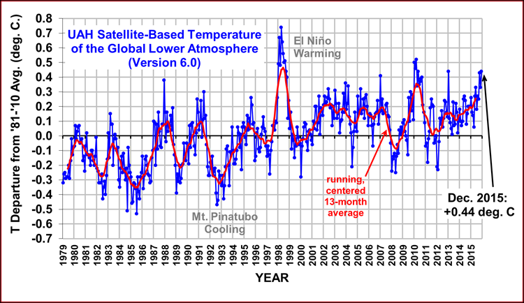
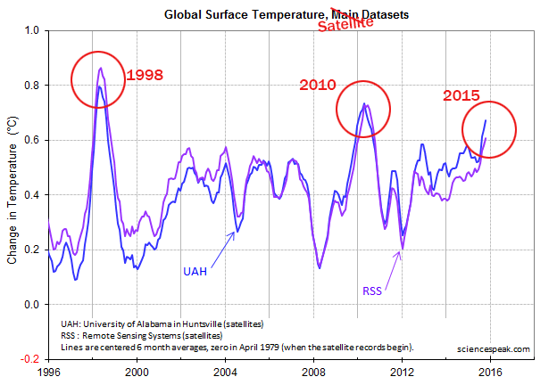
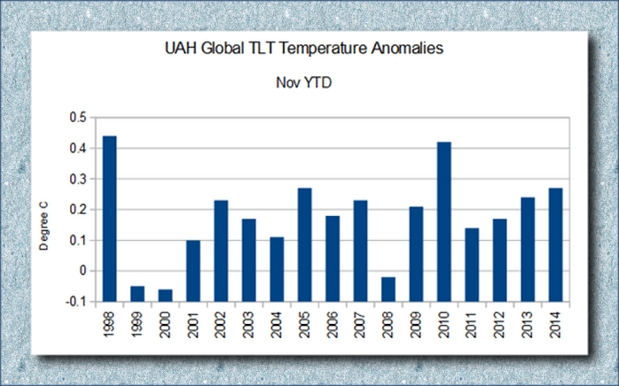
The two main research groups tracking global lower-tropospheric temperatures (our UAH group, and the Remote Sensing Systems [RSS] group) show 2014 lagging significantly behind 2010 and especially 1998:
Viewed another way:
Another instance highlighting the NOAA’s overestimating temperature is when it said October was the hottest month ever, but RSS data showed October to be ninth warmest on record. And I wonder what family members on the East-Coast would say to there being more than 400 record lows and record cool highs set, via The Weather Channel (11/2014):
A third surge of cold air pushed into the Northern Plains, Upper Midwest and East Coast. This third surge reinforced the cold temperatures for millions of Americans who have already endured at least a week of January-like chill.
There have been more than 400 record lows and record cool highs set, covering 43 states, since Sunday. That leaves only five states in the contiguous U.S., all in New England, that have not experienced record cold temperatures this week.
On Wednesday morning record lows were broken or tied from New York to Houston. Thursday morning brought more record cold to parts of the Southeast.
[….]
– First arctic surge: Spread into the East last week (November 11-15).
– Second arctic surge: Blasted through the East, Midwest, and South through early Thursday (November 16-20). For parts of the mid-Mississippi Valley, Ohio Valley, Tennessee Valley and the Middle Atlantic States, this was the coldest of the surges, with numerous daily record lows broken.
– Third arctic surge: Reached the Northern Plains and Upper Midwest Thursday, then slid east across the Great Lakes and parts of the Northeast on Friday. It did not press nearly as far south as the first and second surges did.
– Cold relief: Relief began in the Rockies, then expanded into the southern Plains and Southeast Wednesday and Thursday. Midwest and Northeast relief arrives this weekend.…
Okay, what we have already seen is that the satellite temperatures say 2014 will NOT BE the hottest year. One should ask what the hottest year was: 1934:
(L.A. Times) A slight adjustment to U.S. temperature records has bumped 1998 as the hottest year in the country’s history and made the Dust Bowl year of 1934 the new record holder, according to NASA.
[….]
That meant that 1998, which had been 0.02 degrees warmer than 1934, was now 0.04 degrees cooler.
This is where I transition to the NOAA temperature, but I wanted to take this transition with help from Dr. Willie Soon (NM), who is an Astrophysicist and Geoscientist at the Solar and Stellar Physics (SSP) Division, Harvard-Smithsonian Center for Astrophysics. (I will embolden the point made below.) More and more scientists have been coming out of the closet and Dr. Soon is one of them. He says in fact that if his community continues “to keep silent and do not express outrage like the one I now feel, the notion of science as a philosophy and way of life will soon be reduced to computer games and animation for the mind-controllers and beauty-contest institutions….” Dr. Soon continues:
2014 hottest year a manipulation
Is this a joke or simply my BAD dream? Prostituting science like this is now consider a virtue. It is no wonder that science writer Lord Ridley said that he has lost his faith on science as an institution.
Why would anyone even bother with claims and insistence of the globe in 2014 being the hottest to a relative colder years all within a few hundredths of a degree Celsius? Poor Anders Celsius should be dancing in his grave.
The claim is based on just one (from a half dozen or so) thermometer-based products whose measurement quality is fraught with uncertainty and with actual error bars at least ten times larger than those claimed “effects”.WMO and others simply pick and choose the “data” that produces the press news they want in time for the Lima, Peru political pow-wow.
In truth the datasets taken as a whole clearly show that the global temperature has been flat-trending for nearly two decades now and that the theory of rising CO2 leading to global warming is sorrowfully exaggerated.
This kind of manipulative science, exemplified by IPCC, WMO, NOAA and what have you, is serving its master in the realm of politics and policy, and is indeed very sickening.
All of them are essentially behaving in ways we would never want any of our school children to behave: cheating and manipulating that are accompanied by careful wording and clever rhetoric….
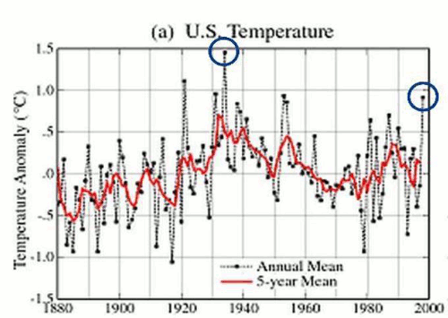
This sets us up for HOW the NOAA gets their temperatures, and why they are inaccurate. The below is posted elsewhere on my blog and is semi-technical for the layman. But the key is PLACEMENT, and you can see that in the photo’s below Dr. Mueller’s presentation on how the numbers are skewed/manipulated.
(Dr. Mueller is part of the Department of Physics at the University of California at Berkeley, and Faculty Senior Scientist at the Lawrence Berkeley Laboratory, where he is also associated with the Institute for Nuclear and Particle Astrophysics.)
ESPIONAGE
There seems to be a misunderstanding by the general public of the NOAA and other organizations and how they misuse data points (or average them wrongly).
So, for instance, professor Mueller at Berkeley mentions how climate “scientists” were hiding the decline in the past:
They were skewing the numbers in other words. This is an example of fraud. But numbers can be skewed by faulty or outdated methods/equipment. For instance,
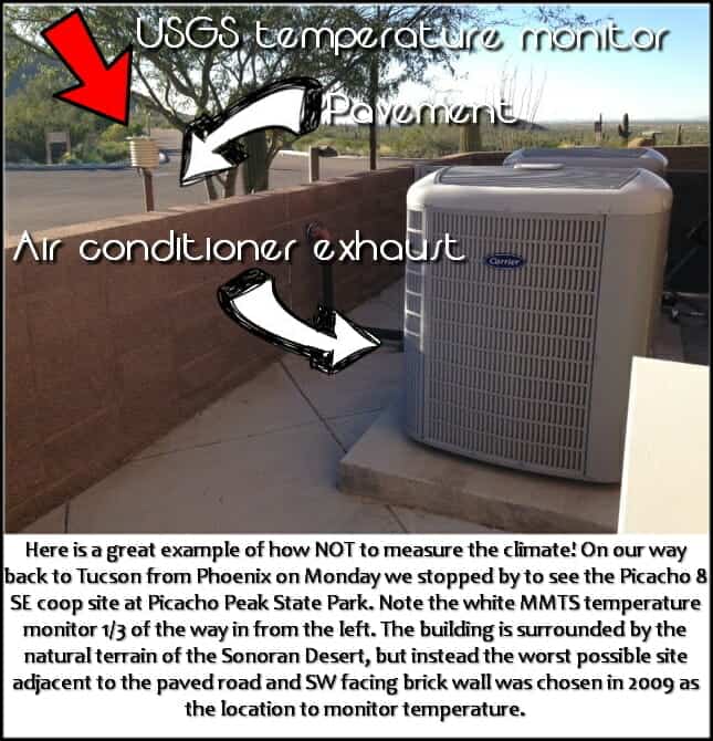
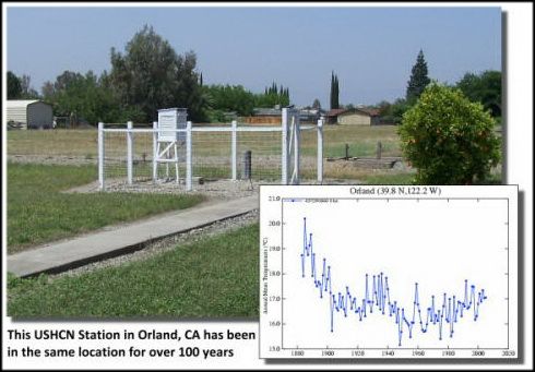
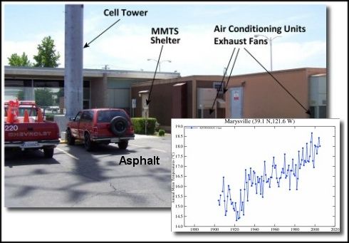
EQUIPMENT FAIL
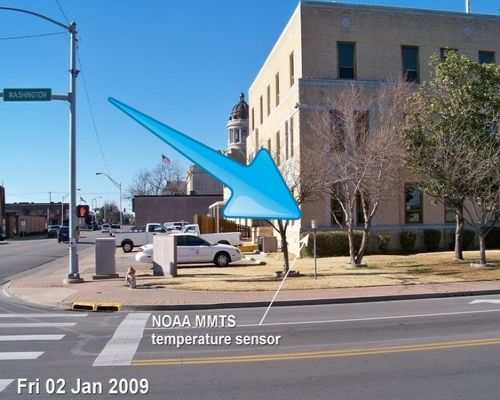
Here is a recent mention of the below in COMMENTARY MAGAZINE (added here 9-4-19):
…A STUDYby meteorologist Anthony Watts found that almost 90 percent of the 1221 weather stations in the U.S. did not meet the National Weather Service’s setting standards, which requires that they be at least 100 feet from any artificial heat source or radiating surface. You can see some of the most egregious violators here. To deal with this defective information, climate scientists, have “adjusted” the data to solve this problem. Invariably, these adjustments have made earlier data show lower temperatures, and recent data show higher ones.
To develop reliable data, the National Oceanic and Atmospheric Administration (NOAA) placed 114 state-of-the-art weather stations relatively evenly spaced about the lower 48 states. They were carefully sited to be away from urban areas, which are heat islands, airports, which can be affected by jet exhaust, etc.
The system became operative in 2005. Now, realclearenergy.com is reporting that there has been no increase in average temperatures in the continental United States over the last 14 years, as measured by these new stations. If anything, overall temperatures are slightly cooler than they were….
Here are some examples of fudged data because of sub-standard equipment:
You’d think the answer would be obvious, but here we have a NOAA operated USHCN climate station of record providing a live experiment. It always helps to illustrate with photos. Today I surveyed a sewage treatment plant, one of 4 stations surveyed today (though I tried for 5) and found that for convenience, they had made a nice concrete walkway to allow servicing the Fisher-Porter rain gauge, which needs a paper punch tape replaced one a month.
Here is what you see in visible light:
Here is what the infrared camera sees:
Note that the concrete surface is around 22-24°C, while the grassy areas are between 12-19°C
Class 5 (error >~= 5C) – Temperature sensor located next to/above an artificial heating source, such a building, roof top, parking lot, or concrete surface.”
More than half of the stations the NOAA use are tainted or wrongly placed equipment.
CHANGING DATA-SETS
Another example of changing averages was noted by Steve Goddard and others — even the NOAA have acknowledge it — have been discussing recently is exemplified in Dr. Judith Carry’s post on the matter (from a larger post of mine):
Even the Wall Street Journal chose the higher temperature reading to say that July of 2012 was July was the “hottest month in the contiguous U.S. since records began in 1895.” WUWT found this on accident and it has led to quite a few other revelations as we will see. Here is description in part of what we looking at:
Glaring inconsistencies found between State of the Climate (SOTC) reports sent to the press and public and the “official” climate database record for the United States. Using NCDC’s own data, July 2012 can no longer be claimed to be the “hottest month on record”.
[….]
I initially thought this was just some simple arithmetic error or reporting error, a one-off event, but then I began to find it in other months when I compared the output from the NCDC climate database plotter. Here is a table of the differences I found for the last two years between claims made in the SOTC report and the NCDC database output.
[….]
In almost every instance dating back to the inception of the CONUS Tavg value being reported in the SOTC report, there’s a difference. Some are quite significant. In most cases, the database value is cooler than the claim made in the SOTC report. Clearly, it is a systemic issue that spans over two years of reporting to the press and to the public.
It suggests that claims made by NCDC when they send out these SOTC reports aren’t credible because there are such differences between the data. Clearly, NCDC means for the plotter output they link to, to be an official representation to the public, so there cannot be a claim of me using some “not fit for purpose” method to get that data….
The WALL STREET JOURNAL made a graph showing this record setting month (below-left). The more accurate temperature for July likewise is shown in the same graph (below-right):
This looking at the data sets chosen and what is used and isn’t used to support an idea that fails in every way. Combine this obvious cherry-picking with the bias, collusion, and charges against the report that the President used to route Congress, all show we have a problem Houston! But this is only the tip of the proverbial iceberg. It seems the NOAA has been skewing these temps for some time. Why? Because the left uses this as a way to promote an ever growing government and the scientists get more-and-more funding. This data fudging story is newer, and it is evolving quickley, including this newest post via Real Science where Steve Goddard notes that More Than 40% Of USHCN Station Data Is Fabricated. Here is Dr. Judith carry’s synopsis (excerpted), in which she critiques a bit Goddard’s post… but then bows to the evidence:
OK, acknowledging that Goddard made some analysis errors, I am still left with some uneasiness about the actual data, and why it keeps changing. For example, Jennifer Marohasy has been writing about Corrupting Australian’s temperature record.
In the midst of preparing this blog post, I received an email from Anthony Watts, suggesting that I hold off on my post since there is some breaking news. Watts pointed me to a post by Paul Homewood entitled Massive Temperature Adjustments At Luling, Texas. Excerpt:
So, I thought it might be worth looking in more detail at a few stations, to see what is going on. In Steve’s post, mentioned above, he links to the USHCN Final dataset for monthly temperatures, making the point that approx 40% of these monthly readings are “estimated”, as there is no raw data.
From this dataset, I picked the one at the top of the list, (which appears to be totally random), Station number 415429, which is Luling, Texas.
Taking last year as an example, we can see that ten of the twelve months are tagged as “E”, i.e estimated. It is understandable that a station might be a month, or even two, late in reporting, but it is not conceivable that readings from last year are late. (The other two months, Jan/Feb are marked “a”, indicating missing days).
But, the mystery thickens. Each state produces a monthly and annual State Climatological Report, which among other things includes a list of monthly mean temperatures by station. If we look at the 2013 annual report for Texas, we can see these monthly temperatures for Luling.
Where an “M” appears after the temperature, this indicates some days are missing, i.e Jan, Feb, Oct and Nov. (Detailed daily data shows just one missing day’s minimum temperature for each of these months).
Yet, according to the USHCN dataset, all ten months from March to December are “Estimated”. Why, when there is full data available?
But it gets worse. The table below compares the actual station data with what USHCN describe as “the bias-adjusted temperature”. The results are shocking.
In other words, the adjustments have added an astonishing 1.35C to the annual temperature for 2013. Note also that I have included the same figures for 1934, which show that the adjustment has reduced temperatures that year by 0.91C. So, the net effect of the adjustments between 1934 and 2013 has been to add 2.26C of warming.
Note as well, that the largest adjustments are for the estimated months of March – December. This is something that Steve Goddard has been emphasising.
It is plain that these adjustments made are not justifiable in any way. It is also clear that the number of “Estimated” measurements made are not justified either, as the real data is there, present and correct.
Watts appears in the comments, stating that he has contacted John Nielsen-Gammon (Texas State Climatologist) about this issue. Nick Stokes also appears in the comments, and one commenter finds a similar problem for another Texas station.
Homewood’s post sheds light on Goddard’s original claim regarding the data drop out (not just stations that are no longer reporting, but reporting stations that are ‘estimated’). I infer from this that there seems to be a real problem with the USHCN data set, or at least with some of the stations. Maybe it is a tempest in a teacup, but it looks like something that requires NOAA’s attention. As far as I can tell, NOAA has not responded to Goddard’s allegations. Now, with Homewood’s explanation/clarification, NOAA really needs to respond….
So we see in the above, that temperatures can be changed years later as the totality of the data is included. What was considered the hottest falls to just an average month in the heat index.
And this has — within the past few months — turned into a very large debate.
EQUIPMENT FAIL II
Here is another example of older/faulty equipment:
A Quick Note about the Difference between RSS and UAH TLT data
There is a noticeable difference between the RSS and UAH lower troposphere temperature anomaly data. Dr. Roy Spencer discussed this in his July 2011 blog post On the Divergence Between the UAH and RSS Global Temperature Records. In summary, John Christy and Roy Spencer believe the divergence is caused by the use of data from different satellites. UAH has used the NASA Aqua AMSU satellite in recent years, while as Dr. Spencer writes:
…RSS is still using the old NOAA-15 satellite which has a decaying orbit, to which they are then applying a diurnal cycle drift correction based upon a climate model, which does not quite match reality.
While the two lower troposphere temperature datasets are different in recent years, UAH believes their data are correct, and, likewise, RSS believes their TLT data are correct. Does the UAH data have a warming bias in recent years or does the RSS data have cooling bias? Until the two suppliers can account for and agree on the differences, both are available for presentation.
ROSE COLORED GLASSES
Another example of competing ideas is this example from two major UK papers, the first being from the Guardian:
This next one from the Daily Mail:
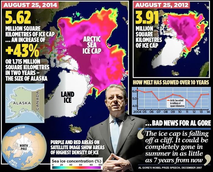
(DAILY MAIL) ….The most widely used measurements of Arctic ice extent are the daily satellite readings issued by the US National Snow and Ice Data Center, which is co-funded by Nasa. These reveal that – while the long-term trend still shows a decline – last Monday, August 25, the area of the Arctic Ocean with at least 15 per cent ice cover was 5.62 million square kilometres.
This was the highest level recorded on that date since 2006 (see graph, right), and represents an increase of 1.71 million square kilometres over the past two years – an impressive 43 per cent.
Other figures from the Danish Meteorological Institute suggest that the growth has been even more dramatic. Using a different measure, the area with at least 30 per cent ice cover, these reveal a 63 per cent rise – from 2.7 million to 4.4 million square kilometres.
[….]
Crucially, the ice is also thicker, and therefore more resilient to future melting. Professor Andrew Shepherd, of Leeds University, an expert in climate satellite monitoring, said yesterday: ‘It is clear from the measurements we have collected that the Arctic sea ice has experienced a significant recovery in thickness over the past year.
‘It seems that an unusually cool summer in 2013 allowed more ice to survive through to last winter. This means that the Arctic sea ice pack is thicker and stronger than usual, and this should be taken into account when making predictions of its future extent.’
Same data used, one says BEWARE, the END IS NEAR, the other says making gains, as the graph shows below:
(So are Polar Bears, BTW) And the Antarctic has made BIG GAINS. But if the left — yes, the left — says we should renter the little ice-age to be at a normal point of “climate disruption,” then they are living a pipe-dream. As the earth gets warmer life flourishes, as warmer periods in history have exemplified:
June was ranked one of the coldest months in a while. According to the NOAA, July 2014 ranked 29th coldest out of 120using the Maximum temperature. And so we enter the discussion about if the pause is real… which is now being acknowledged by almost all (except the IPCC).
PAUSE
Here is Dr. Judith Curry posting ion the subject before getting into two papers that talk about it from two points of view:
With 39 explanations and counting, and some climate scientists now arguing that it might last yet another decade, the IPCC has sidelined itself in irrelevance until it has something serious to say about the pause and has reflected on whether its alarmism is justified, given its reliance on computer models that predicted temperature rises that have not occurred. – Rupert Darwall
The statement by Rupert Darwall concisely states what is at stake with regards to the ‘pause.’ This seriously needs to be sorted out….
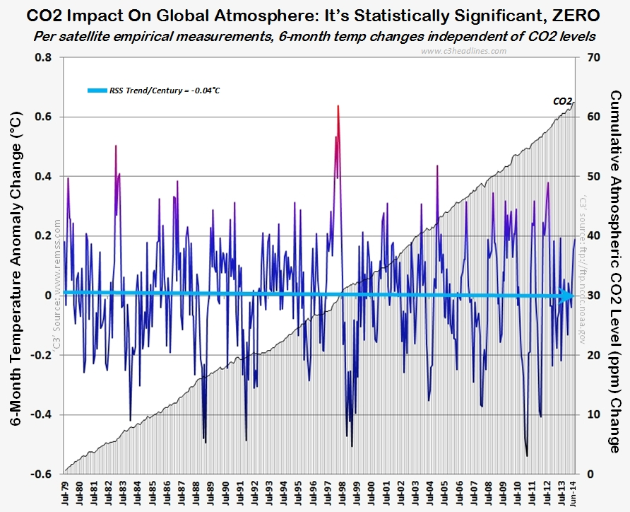
For a running — updated — list of these excuses mentioned above, see here.What HAS been clearly shown is that while some wish to make CO2 illegal, CO2 is in fact not driving the climate:
GROUP-THINK
What is being shown as of late is that more-and-more scientists are becoming concerned with the group-think in the climate-sciences. Again, Dr. Judith Curry was the biggest pro-AGW proponent, but has — like many others leaders in their respective field — changed or softened her/their positions on what the science is actually showing:
The implications of dogmatic groupthink and intimidation for the pursuit of sound science — and sound policy — are chilling. – Christopher Snowden
A collection of articles from the health science community on the fate of papers and scientists that challenge the consensus.
SUN & OCEAN
Gross Scientific Negligence – IPCC Ignored Huge Body Of Peer-Reviewed Literature Showing Sun’s Clear Impact – See more at: http://tinyurl.com/kw47zcf (NASA is changing on this as well)
NASA is saying the sun — thanks to the Goddard Institute studying this, is the driver of warming and cooling: http://tinyurl.com/m29yo99 (Via Hockey Shtick)
And yet another study is showing the sun as the major player… NOT greenhouse gases.
So what’s the bottom line? NOAA temps change over time. Many in this respective field are seeing group-think. Ideology is driving this group-think, not science.
Why should you be interested? Sea surface temperature records indicate El Niño and La Niña events are responsible for the warming of global sea surface temperature anomalies over the past 30 years, not man-made greenhouse gases. I’ve searched sea surface temperature records for more than 4 years and ocean heat content records for more than 3 years, and I can find no evidence of an anthropogenic greenhouse gas signal in either dataset. That is, the warming of the global oceans has been caused by naturally occurring, sunlight-fueled, coupled ocean-atmosphere processes, not anthropogenic greenhouse gases.
No matter what evidences one puts forward, until people remove their rose-colored glasses, they will continue to explain away the pause showing CO2 has nothing to do with global temperatures.


