Satellite Drift and Global Warming

[For the bottom line people]

“We’ve looked at their new results versus our data, and it does appear that the new warming they’ve ‘found’ is just spurious warming in the old (poorly-calibrated, and orbit time-drifting) NOAA-14 MSU instrument, which they leave in the data analysis,” Roy Spencer, a climatologist at the University of Alabama in Huntsville, told TheDCNF.

“We remove that spurious warming since it disagrees with the newer (better calibrated, non-drifting) NOAA-15 AMSU instrument flying at the same time,” Spencer said.

[….]

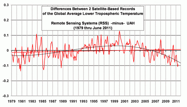
The new RSS data runs much higher than UAH satellite data, run by Spencer and Dr. John Christy, which only shows a warming trend of 0.072 degrees Celsius per decade. RSS also runs hotter than weather balloon data, which show about the same or less warming than UAH data.

(Daily Caller)

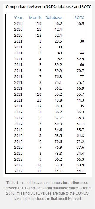
One of the issues that have recently come up in conversation is that the Satellite data has been wrong for essentially 19-years is showing a pause in global warming… even though mankind has produced almost two-thirds of the CO2 since the Industrial revolution in that same time. U.S. News and World Report puts it thus:

Climate change doubters may have lost one of their key talking points: a particular satellite temperature dataset that had seemed to show no warming for the past 18 years.

The Remote Sensing System temperature data, promoted by many who reject mainstream climate science and especially most recently by Sen. Ted Cruz, now shows a slight warming of about 0.18 degrees Fahrenheit since 1998. Ground temperature measurements, which many scientists call more accurate, all show warming in the past 18 years.

“There are people that like to claim there was no warming; they really can’t claim that anymore,” said Carl Mears, the scientist who runs the Remote Sensing System temperature data tracking.

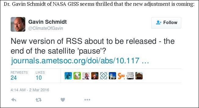
The change resulted from an adjustment Mears made to fix a nagging discrepancy in the data from 15 satellites.

The satellites are in a polar orbit, so they are supposed to go over the same place at about the same time as they circle from north to south pole. Some of the satellites drift a bit, which changes their afternoon and evening measurements ever so slightly. Some satellites had drift that made temperatures warmer, others cooler. Three satellites had thrusters and they stayed in the proper orbit so they provided guidance for adjustments.

Mears said he was “motivated by fixing these differences between the satellites. If the differences hadn’t been there, I wouldn’t have done the upgrade.”

NASA chief climate scientist Gavin Schmidt and Andrew Dessler, a climate scientist at Texas A&M, said experts and studies had shown these problems that Mears adjusted and they both said those adjustments make sense and are well supported in a study in the American Meteorological Society’s Journal of Climate….

This “orbital drift” is based on a paper by Carl A. Mears and Frank J. Wentz, which was first submitted to Journal of Geophysical Research, and had the paper rejected. They then “revamped” the paper, and turned it into the Journal of Climate. Keep in mind that there are only two groups working on this stuff… it is a highly specialized field, and Dr. Roy Spencer and Dr. John Christy were and are key to understanding this data set and any changes to it (see appendix). Anthony Watts asked about the paper and their review of it:

UPDATE1: Given this sort of work has only two groups doing it, it is a very narrow field of scientific specialty, I asked Dr. Spencer this question:

I assume neither you or Christy were asked to review this paper? There aren’t many satellite temperature data experts in the world.

He replied:

Interesting question…. John reviewed their original paper submission to Journal of Geophysical Research, in detail, asking for additional evidence — but not advocating rejection of the paper.  The JGR editor ended up rejecting it anyway. Mears & Wentz then revised the paper, submitted it to Journal of Climate instead, and likely asked that we be excluded as reviewers.

As it turns out ~ there is something afoot. Three excellent posts…

JUDITH CURRY notes that the revised paper was not peer reviewed by these two juggernauts in the satellite “maintenance” — also noting that really we (myself included) are prematurely discussing this issue:

The climate models project strong warming in the tropical mid troposphere, which have not been borne out by the observations.  The new RSS data set reduces the discrepancies with the climate model simulations.

Roy Spencer’s comments substantially reduce the credibility of the new data set. Their dismissal of the calibration problems with the NOAA-14 MSU is just astonishing.  Presumably Christy’s review of the original submission to JGR included this critique, so they are unlikely to be unaware of this issue.  The AMS journals have one the best review processes out there; I am not sure why Christy/Spencer weren’t asked to review.  I have in the past successfully argued at AMS not to have as reviewers individuals that have made negative public statements about me (not sure if this is the case with Mears/Wentz vs Spencer/Christy).

There is a legitimate debate on how to correct for the diurnal cycle, but based on my assessment, the UAH empirically based approach seems better.

With regards to the ‘pause.’  The ‘pause’ in warming has generally been assessed using the lower tropospheric temperatures, which aren’t yet available from the new dataset.  So it is not yet clear what impact the new data set will have on our interpretation of the pause.

With regards to the Feb 2016 spike, I think Bob Tisdale gets it mostly right.  While a spike from the El Nino is expected, the Feb 2016 seems anomalous and largely associated with a warm spike in the Arctic (of ‘weather’ origin).  I would expect a few more months of anomalously warm temperatures before the El Nino fades.  I’m not sure what to make of the ‘re-emergent blob’ scenario.

We won’t know what the 2016 El Nino spike looks like until the end of the year.  Then we can compare the 1997/1998 temperatures with 2015/2016 temperatures in a (cherry-less) apples to apples comparison, to assess the underlying trend in temperatures from 1998-2016.  The trend will undoubtedly be positive, but most likely it will remain substantially less than the trend predicted by the climate models.

And what of the years following 2016?  Will we see cooling and then a continuation of flat temperatures?  Or continued warming?  I suspect that there will be some cooling and continued flatness.  I’ve stated before that it will be another 5 years before we have the appropriate prospective on the current temperature fluctuations and whether or not the early 21st century pause is over.

We just have to grab some popcorn and watch…better stock up, this is gonna take a while.

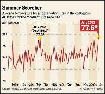
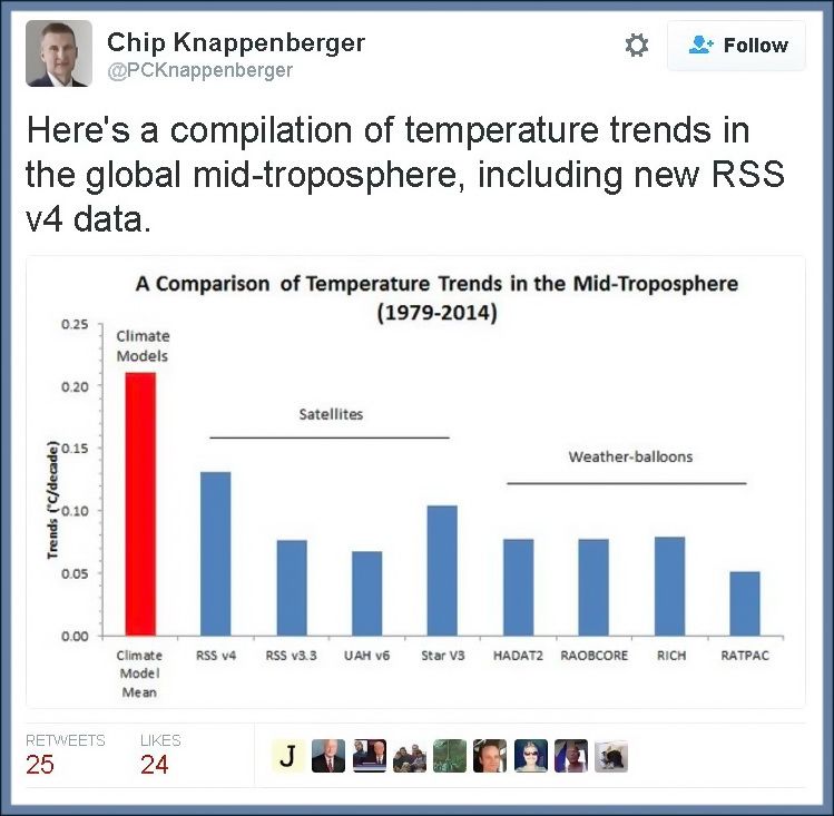
But still worth noting, EVEN IF you include the new data… we see modeling waaay overblown:

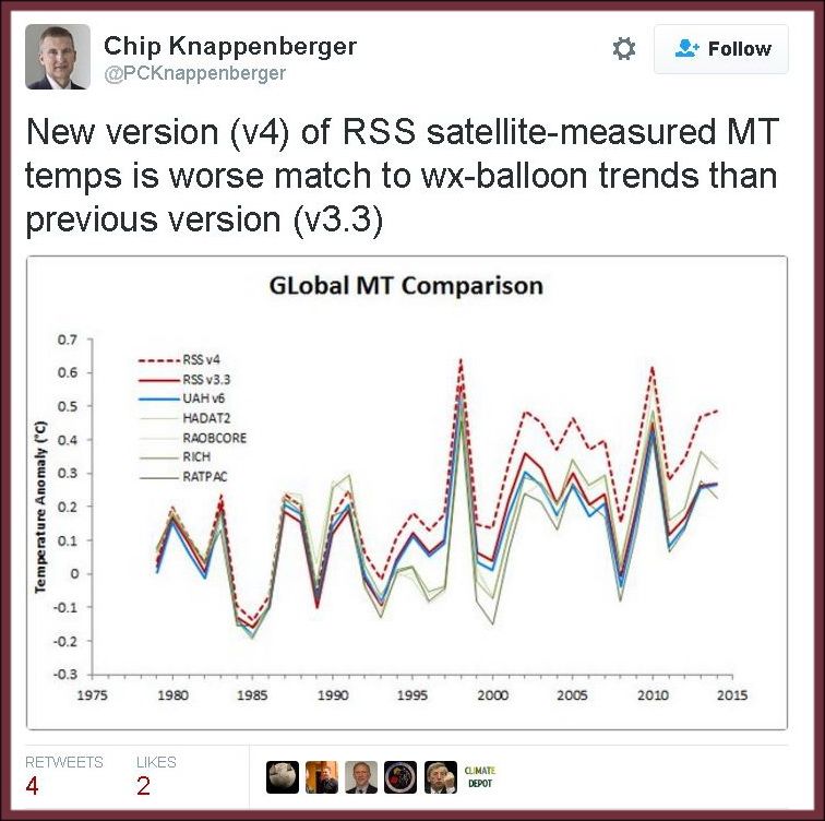
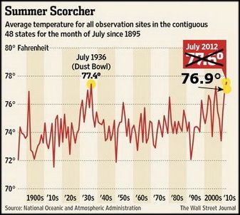
Without the new — I would say, messaged data from one satellite — we see a great comparison lining up of many tracks of reliable temps:

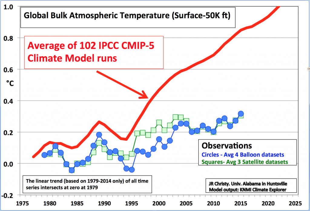
The models are 100% wrong. 100%


APPENDIX


…For their achievement, the Spencer-Christy team was awarded NASA’s Medal for Exceptional Scientific Achievement in 1991 and a Special Award by the American Meteorological Society in 1996 “for developing a global, precise record of earth’s temperature from operational polar-orbiting satellites, fundamentally advancing our ability to monitor climate.” In January 2002 Christy was inducted as a Fellow of the American Meteorological Society.

The data is published monthly, available for all to review. The satellite measurements have been a lightning rod for those who advocate that human emissions of greenhouse gases, particularly carbon dioxide (CO2), are causing significant global warming. There have been three relatively minor errors in the calculations that, when determined, were promptly corrected. Which is how science should work. The corrections involved orbital decay, orbital drift, and the cooling of the stratosphere. The measurement of temperatures, from the surface to roughly 50,000 feet (15 km) altitude, includes the layer for the “Hot Spot” and avoids the cooling stratosphere.

Calculations are now made by three separate groups, UAH, Remote Sensing Systems (RSS), and a group with the University of Washington. In addition, Christy uses four separate sets of radiosonde data from weather balloons to verify his work. The correspondence among these datasets is very close.

Also, Christy served as a contributor or lead author (2001) to the first four reports by the UN Intergovernmental Panel on Climate Change.

As state climatologist, Christy stated that, according to global climate models, the Paris Agreement to cut CO2 emissions will have an impact on temperatures so small that it cannot be measured. Further, he stated that based on research, if surface temperatures are used to estimate the greenhouse effect, daytime highs better serve the purpose than nighttime temperatures or averages. Daytimes highs are less influenced by changes in land use such as urbanization

[….]

John Christy exemplifies the perseverance, dedication to empirical science, and humanity befitting the Frederick Seitz Memorial Award.

Corrupted Data-Sets Due to Equipment Failure/Placement

EQUIPMENT FAIL

Here are some examples of fudged data because of sub-standard equipment:

You’d think the answer would be obvious, but here we have a NOAA operated USHCN climate station of record providing a live experiment. It always helps to illustrate with photos. Today I surveyed a sewage treatment plant, one of 4 stations surveyed today (though I tried for 5) and found that for convenience, they had made a nice concrete walkway to allow servicing the Fisher-Porter rain gauge, which needs a paper punch tape replaced one a month.

Here is what you see in visible light:

Here is what the infrared camera sees:

Note that the concrete surface is around 22-24°C, while the grassy areas are between 12-19°C

This station will be rated a CRN5 by this definition from the NOAA Climate Reference Network handbook, section 2.2.1:

Class 5 (error >~= 5C) – Temperature sensor located next to/above an artificial heating source, such a building, roof top, parking lot, or concrete surface.”

More than half of the stations the NOAA use are tainted or wrongly placed equipment.

CHANGING DATA-SETS

Another example of changing averages was noted by Steve Goddard and others — even the NOAA have acknowledge it — have been discussing recently is exemplified in Dr. Judith Carry’s post on the matter (from a larger post of mine):


Even the Wall Street Journal chose the higher temperature reading to say that July of 2012 was July was the “hottest month in the contiguous U.S. since records began in 1895.” WUWT found this on accident and it has led to quite a few other revelations as we will see. Here is description in part of what we looking at:

Glaring inconsistencies found between State of the Climate (SOTC) reports sent to the press and public and the “official” climate database record for the United States. Using NCDC’s own data, July 2012 can no longer be claimed to be the “hottest month on record”.

[….]

I initially thought this was just some simple arithmetic error or reporting error, a one-off event, but then I began to find it in other months when I compared the output from the NCDC climate database plotter. Here is a table of the differences I found for the last two years between claims made in the SOTC report and the NCDC database output.

[….]

In almost every instance dating back to the inception of the CONUS Tavg value being reported in the SOTC report, there’s a difference. Some are quite significant. In most cases, the database value is cooler than the claim made in the SOTC report. Clearly, it is a systemic issue that spans over two years of reporting to the press and to the public.

It suggests that claims made by NCDC when they send out these SOTC reports aren’t credible because there are such differences between the data. Clearly, NCDC means for the plotter output they link to, to be an official representation to the public, so there cannot be a claim of me using some “not fit for purpose” method to get that data….

The Wall Street Journal made a graph showing this record setting month (below-left). The more accurate temperature for July likewise is shown in the same graph (below-right):

This looking at the data sets chosen and what is used and isn’t used to support an idea that fails in every way. Combine this obvious cherry-picking with the bias, collusion, and charges against the report that the President used to route Congress, all show we have a problem Houston! But this is only the tip of the proverbial iceberg. It seems the NOAA has been skewing these temps for some time. Why? Because the left uses this as a way to promote an ever growing government and the scientists get more-and-more funding. This data fudging story is newer, and it is evolving quickley, including this newest post via Real Science where Steve Goddard notes that More Than 40% Of USHCN Station Data Is Fabricated. Here is Dr. Judith carry’s synopsis (excerpted), in which she critiques a bit Goddard’s post… but then bows to the evidence:

OK, acknowledging that Goddard made some analysis errors, I am still left with some uneasiness about the actual data, and why it keeps changing. For example, Jennifer Marohasy has been writing about Corrupting Australian’s temperature record.

In the midst of preparing this blog post, I received an email from Anthony Watts, suggesting that I hold off on my post since there is some breaking news. Watts pointed me to a post by Paul Homewood entitled Massive Temperature Adjustments At Luling, Texas. Excerpt:

So, I thought it might be worth looking in more detail at a few stations, to see what is going on. In Steve’s post, mentioned above, he links to the USHCN Final dataset for monthly temperatures, making the point that approx 40% of these monthly readings are “estimated”, as there is no raw data.

From this dataset, I picked the one at the top of the list, (which appears to be totally random), Station number 415429, which is Luling, Texas.

Taking last year as an example, we can see that ten of the twelve months are tagged as “E”, i.e estimated. It is understandable that a station might be a month, or even two, late in reporting, but it is not conceivable that readings from last year are late. (The other two months, Jan/Feb are marked “a”, indicating missing days).

But, the mystery thickens. Each state produces a monthly and annual State Climatological Report, which among other things includes a list of monthly mean temperatures by station. If we look at the 2013 annual report for Texas, we can see these monthly temperatures for Luling.

Where an “M” appears after the temperature, this indicates some days are missing, i.e Jan, Feb, Oct and Nov. (Detailed daily data shows just one missing day’s minimum temperature for each of these months).

Yet, according to the USHCN dataset, all ten months from March to December are “Estimated”. Why, when there is full data available?

But it gets worse. The table below compares the actual station data with what USHCN describe as “the bias-adjusted temperature”. The results are shocking.

In other words, the adjustments have added an astonishing 1.35C to the annual temperature for 2013. Note also that I have included the same figures for 1934, which show that the adjustment has reduced temperatures that year by 0.91C. So, the net effect of the adjustments between 1934 and 2013 has been to add 2.26C of warming.

Note as well, that the largest adjustments are for the estimated months of March – December. This is something that Steve Goddard has been emphasising.

It is plain that these adjustments made are not justifiable in any way. It is also clear that the number of “Estimated” measurements made are not justified either, as the real data is there, present and correct.

Watts appears in the comments, stating that he has contacted John Nielsen-Gammon (Texas State Climatologist) about this issue. Nick Stokes also appears in the comments, and one commenter finds a similar problem for another Texas station.

Homewood’s post sheds light on Goddard’s original claim regarding the data drop out (not just stations that are no longer reporting, but reporting stations that are ‘estimated’). I infer from this that there seems to be a real problem with the USHCN data set, or at least with some of the stations. Maybe it is a tempest in a teacup, but it looks like something that requires NOAA’s attention. As far as I can tell, NOAA has not responded to Goddard’s allegations. Now, with Homewood’s explanation/clarification, NOAA really needs to respond….

(H/T to Climate Realist ~ See WUWT and Hockey Schtick for more)


So we see in the above, that temperatures can be changed years later as the totality of the data is included. What was considered the hottest falls to just an average month in the heat index.

And this has — within the past few months — turned into a very large debate.

EQUIPMENT FAIL II

Here is another example of older/faulty equipment:

A Quick Note about the Difference between RSS and UAH TLT data

There is a noticeable difference between the RSS and UAH lower troposphere temperature anomaly data. Dr. Roy Spencer discussed this in his July 2011 blog post On the Divergence Between the UAH and RSS Global Temperature Records.  In summary, John Christy and Roy Spencer believe the divergence is caused by the use of data from different satellites.  UAH has used the NASA Aqua AMSU satellite in recent years, while as Dr. Spencer writes:

…RSS is still using the old NOAA-15 satellite which has a decaying orbit, to which they are then applying a diurnal cycle drift correction based upon a climate model, which does not quite match reality.

I updated the graphs in Roy Spencer’s post in On the Differences and Similarities between Global Surface Temperature and Lower Troposphere Temperature Anomaly Datasets.

While the two lower troposphere temperature datasets are different in recent years, UAH believes their data are correct, and, likewise, RSS believes their TLT data are correct.  Does the UAH data have a warming bias in recent years or does the RSS data have cooling bias?  Until the two suppliers can account for and agree on the differences, both are available for presentation.


Walter Cronkite on Ice-Age (1972 Video) ~ Billion Dollar Ind.

Via NEWSBUSTERS:

On September 11, 1972, Cronkite cited scientists’ predictions that there was a “new ice age” coming. He called that prediction from British scientist Hubert Lamb “a bit of bad news.”

Cronkite continued. “That while the weather may be just a little colder in the immediate years to come, the full extent of the new ice age won’t be reached for 10,000 years. And if you can stand any more good news, even then it won’t be as bad as the last ice age 60,000 years ago. Then New York, Cincinnati, St. Louis, were under 5,000 feet of ice. Presumably no traffic moved and school was let out for the day. And that’s the way it is, Monday, September 11, 1972.”

Lamb, the scientist Cronkite cited, was no fringe scientist. He founded the Climatic Research Unit at the University of East Anglia in Great Britain. When he died, the CRU director called him “the greatest climatologist of his time,” according to the Global Warming Policy Foundation. He was also credited with establishing “climate change as a serious research subject.”  

Unlike scientists often quoted by the media today, GWPF said that Lamb viewed the Earth’s climate as changing constantly and naturally. Unlike its founder, CRU now has a major role in spreading global warming alarmism. CBS said in 2009, CRU “wields outsize influence” in warming circles. The Climategate scandal centered around leaked documents and emails from that organization….

…READ IT ALL…

Scaring the public in order to get funding is a multi-billion dollar industry, as is the push by leftists to “conquer” once and for all (since the days of Marx) “capitalism.” M.I.T.’s Richard Lindzen notes:

  • Billions of dollars have been poured into studies supporting climate alarm, and trillions of dollars have been involved in overthrowing the energy economy. So it is unsurprising that great efforts have been made to ramp up hysteria, even as the case for climate alarm is disintegrating.

One should FOLLOW THE MONEY!

The following resignation letter was sent by Hal Lewis, professor emeritus of physics at the University of California, Santa Barbara, to the American Physical Society:

Sent: Friday, 08 October 2010 17:19 Hal Lewis
From: Hal Lewis, University of California, Santa Barbara
To: Curtis G. Callan, Jr., Princeton University, President of the American Physical Society
6 October 2010

Dear Curt:

When I first joined the American Physical Society sixty-seven years ago it was much smaller, much gentler, and as yet uncorrupted by the money flood (a threat against which Dwight Eisenhower warned a half-century ago).

Indeed, the choice of physics as a profession was then a guarantor of a life of poverty and abstinence—it was World War II that changed all that. The prospect of worldly gain drove few physicists. As recently as thirty-five years ago, when I chaired the first APS study of a contentious social/scientific issue, The Reactor Safety Study, though there were zealots aplenty on the outside there was no hint of inordinate pressure on us as physicists. We were therefore able to produce what I believe was and is an honest appraisal of the situation at that time. We were further enabled by the presence of an oversight committee consisting of Pief Panofsky, Vicki Weisskopf, and Hans Bethe, all towering physicists beyond reproach. I was proud of what we did in a charged atmosphere. In the end the oversight committee, in its report to the APS President, noted the complete independence in which we did the job, and predicted that the report would be attacked from both sides. What greater tribute could there be?

How different it is now. The giants no longer walk the earth, and the money flood has become the raison d’être of much physics research, the vital sustenance of much more, and it provides the support for untold numbers of professional jobs. For reasons that will soon become clear my former pride at being an APS Fellow all these years has been turned into shame, and I am forced, with no pleasure at all, to offer you my resignation from the Society….

(HEARTLAND | WATTS UP WITH THAT | CLIMATE REALIST | NEWSMAX)

Selected highlights from the above video via CLIMATE DEPOT:

Lindzen on VP Joe Biden saying ‘Denying climate change is like denying gravity.’


Lindzen: ‘He’s absolutely right. Climate has been changing for 4.5  billion years and on all time scales.

This is the problem. These guys think saying climate changes, saying it gets warmer or colder by a few tenths of a degree should be taken as evidence that the end of the world is coming. And it completely ignores the fact that until this hysteria, climate scientists used to refer to the warm periods in our history as optima.

Lindzen on CO2: ‘So here we are demonizing a chemical — a molecule essential to life – CO2– we are declaring doom based on things we used to like and somehow we are supposed to overturn our whole economy in order to deal with this purported disaster.’

Lindzen on EPA Chief: ‘Obviously I don’t think [the science] matters to [EPA Chief] McCarthy. She has a political aim. She has her marching orders and they are the orders regardless of what the underlying science is.’

Lindzen on what impact EPA regs will have on climate: ‘No matter what you believe about climate, none of them will have any impact on climate. They do make energy more expensive less available, less useful, they do hurt the poor, and they raise prices. It’s hard to see what the upside is excerpt for the people who get the subsidies. The whole thing is fairly absurd. There is so much money changing hands.’


ADDITION


BREITBART notes another interesting “evolving” positions towards evidence:

The American Physical Society (APS) has signalled a dramatic turnabout in its position on “climate change” by appointing three notorious climate skeptics to its panel on public affairs (POPA).

They are:

Professor Richard Lindzen, formerly Alfred P Sloan Professor of Meteorology at Massachussetts Institute of Technology (MIT), a highly regarded physicist who once described climate change alarmism on The Larry King Show as “mainly just like little kids locking themselves in darkclosets to see how much they can scare each other and themselves.”

John Christy, Professor of Atmospheric Science at the University of Alabama in Huntsville, who has written: “I’m sure the majority (but not all) of my IPCC colleagues cringe when Isay this, but I see neither the developing catastrophe nor the smokinggun proving that human activity is to blame for most of the warming wesee.”

Judith Curry, Chair of the School of Earth and Atmospheric Sciences at Georgia Tech, a former Warmist (and still a self-described “luke warmer”) who has infuriated many of her more extremist colleagues by defending skeptics and by testifying to the US House Subcommittee on the Environment that the uncertainties in forecasting climate science are much greater than the alarmists will admit.

As Anthony Watts has noted, this is news guaranteed to make a Warmist’s head explode.

The reason it’s so significant is that it comes only three years after one of the APS’s most distinguished members – Professor Hal Lewis – resigned in disgust at its endorsement of what he called “the global warming scam.”…..