(Transcript of the above) What a great video! Here is a recent passage that is somewhat saying the same things as part of the above segment has:
One last thing. I have long been fascinated by how many people who hold a religious faith do so because they discovered it in adulthood, not because they were raised in it by their parents. Indeed, claims such as “You’re only a Christian because your parents were!” have always smacked to me of desperation, on a par with “You’re only pessimistic because you’re English.”102 It’s also an ill-tempered Rottweiler of an argument, for it can quickly turn around and bite your own hand; after all, if it were true, it would apply to atheists too. I have no idea what Dawkins’s daughter, Juliet, does or does not believe – but if she is an atheist like her father, I hope she isn’t having to fend off argumentative Anglicans dinging her around the head with sound bites like “You are only an atheist because your daddy is.” Or maybe Dawkins displayed incredible philosophical consistency and raised her as a Mennonite, just so he couldn’t be accused of foisting his beliefs on his child.
[102] As James Branch Cabell quipped, the difference between a pessimist and an optimist is that an optimist believes that we live in the best of all possible worlds; a pessimist fears that this may be true.
Andy Banister, The Atheist Who Didn’t Exist: Or, The Dreadful Consequences of Bad Arguments (Oxford, England: Monarch Books, 2015), 78-79.
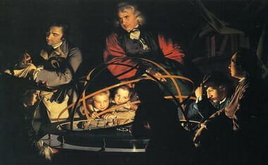
Biologist Jonathan Wells, author and M.D. Geoffrey Simmons, and molecular biologist Douglas Axe shed light on the problems with Darwin’s theory as they share what led each of them to their skepticism.
Jonathan Wells first became skeptical of Darwin’s mechanism of natural selection, but it was in his studies in embryology that he became skeptical of common ancestry. Dr. Wells takes a historical look at the impact of Darwin’s theory and discusses how unnecessary it is for modern science.
Geoffrey Simmons, M.D., explains how he became a Darwin skeptic after looking at the evidence and finding the evidence for evolution lacking.
And Molecular biologist Douglas Axe from Biologic Institute explains the problems genetic mutations pose for Darwin’s theory.
I commented right away on my FB on Melania Trump’s speech being lifted off of Michelle Obama. Here is that commentary:
★ MELANIA ★
from a young age, my parents impressed on me the values that you work hard for what you want in life. That your word is your bond and you do what you say and keep your promise. that you treat people with respect. They taught and showed me values and morals in their daily life. That is a lesson that I continue to pass along to our son, and we need to pass those lessons on to the many generations to follow because we want our children in this nation to know that the only limit to your achievements is the strength of your dreams and your willingness to work for them.
★ MICHELLE ★ and Barack and I were raised with so many of the same values: that you work hard for what you want in life; that your word is your bond and you do what you say you’re going to do; that you treat people with dignity and respect, even if you don’t know them, and even if you don’t agree with them. And Barack and I set out to build lives guided by these values, and pass them on to the next generation.Because we want our children — and all children in this nation — to know that the only limit to the height of your achievements is the reach of your dreams and your willingness to work for them.
[….]
There are some good side-by-side videos there as well. I don’t see this as a problem. We know Michelle Obama and her husband… their entire career saddled up with Marxists and radicals/racists didn’t mean what they said in the campaign. I bet as well that Melania has been proud of these United States plenty of times prior to Trump running. In other words, I doubt you will EVER hear Melania say something like this:
➤ “[F]or the first time in my adult lifetime, I am really proud of my country. And not just because Barack has done well, but because I think people are hungry for change. I have been desperate to see our country moving in that direction…” — Michelle Obama
So the two speeches (if Trump wins) are a great petri-dish experiment. Both said the same thing… let us see who actually does it. Although, Obama’s word IS his bond, and he DID SAY he wanted to fundamentally change the country.
However, for many days afterword the nets went ape-shit over it (so I heard… I do not have TV). Why haven’t they done the same for their messiah in times past?
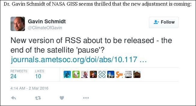
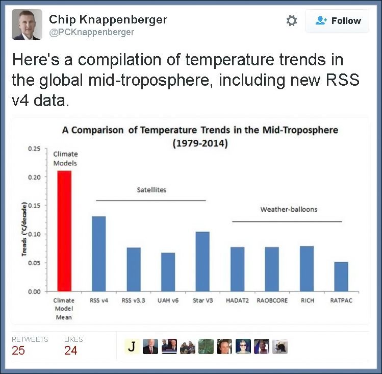
“We’ve looked at their new results versus our data, and it does appear that the new warming they’ve ‘found’ is just spurious warming in the old (poorly-calibrated, and orbit time-drifting) NOAA-14 MSU instrument, which they leave in the data analysis,” Roy Spencer, a climatologist at the University of Alabama in Huntsville, told TheDCNF.
“We remove that spurious warming since it disagrees with the newer (better calibrated, non-drifting) NOAA-15 AMSU instrument flying at the same time,” Spencer said.
[….]
The new RSS data runs much higher than UAH satellite data, run by Spencer and Dr. John Christy, which only shows a warming trend of 0.072 degrees Celsius per decade. RSS also runs hotter than weather balloon data, which show about the same or less warming than UAH data.
One of the issues that have recently come up in conversation is that the Satellite data has been wrong for essentially 19-years is showing a pause in global warming… even though mankind has produced almost two-thirds of the CO2 since the Industrial revolution in that same time. U.S. News and World Report puts it thus:
Climate change doubters may have lost one of their key talking points: a particular satellite temperature dataset that had seemed to show no warming for the past 18 years.
The Remote Sensing System temperature data, promoted by many who reject mainstream climate science and especially most recently by Sen. Ted Cruz, now shows a slight warming of about 0.18 degrees Fahrenheit since 1998. Ground temperature measurements, which many scientists call more accurate, all show warming in the past 18 years.
“There are people that like to claim there was no warming; they really can’t claim that anymore,” said Carl Mears, the scientist who runs the Remote Sensing System temperature data tracking.
The change resulted from an adjustment Mears made to fix a nagging discrepancy in the data from 15 satellites.
The satellites are in a polar orbit, so they are supposed to go over the same place at about the same time as they circle from north to south pole. Some of the satellites drift a bit, which changes their afternoon and evening measurements ever so slightly. Some satellites had drift that made temperatures warmer, others cooler. Three satellites had thrusters and they stayed in the proper orbit so they provided guidance for adjustments.
Mears said he was “motivated by fixing these differences between the satellites. If the differences hadn’t been there, I wouldn’t have done the upgrade.”
NASA chief climate scientist Gavin Schmidt and Andrew Dessler, a climate scientist at Texas A&M, said experts and studies had shown these problems that Mears adjusted and they both said those adjustments make sense and are well supported in a study in the American Meteorological Society’s Journal of Climate….
This “orbital drift” is based on a paper by Carl A. Mears and Frank J. Wentz, which was first submitted to Journal of Geophysical Research, and had the paper rejected. They then “revamped” the paper, and turned it into the Journal of Climate. Keep in mind that there are only two groups working on this stuff… it is a highly specialized field, and Dr. Roy Spencer and Dr. John Christy were and are key to understanding this data set and any changes to it (see appendix). Anthony Watts asked about the paper and their review of it:
UPDATE1: Given this sort of work has only two groups doing it, it is a very narrow field of scientific specialty, I asked Dr. Spencer this question:
I assume neither you or Christy were asked to review this paper? There aren’t many satellite temperature data experts in the world.
He replied:
Interesting question…. John reviewed their original paper submission to Journal of Geophysical Research, in detail, asking for additional evidence — but not advocating rejection of the paper. The JGR editor ended up rejecting it anyway. Mears & Wentz then revised the paper, submitted it to Journal of Climate instead, and likely asked that we be excluded as reviewers.
As it turns out ~ there is something afoot. Three excellent posts…
JUDITH CURRY notes that the revised paper was not peer reviewed by these two juggernauts in the satellite “maintenance” — also noting that really we (myself included) are prematurely discussing this issue:
The climate models project strong warming in the tropical mid troposphere, which have not been borne out by the observations. The new RSS data set reduces the discrepancies with the climate model simulations.
Roy Spencer’s comments substantially reduce the credibility of the new data set. Their dismissal of the calibration problems with the NOAA-14 MSU is just astonishing. Presumably Christy’s review of the original submission to JGR included this critique, so they are unlikely to be unaware of this issue. The AMS journals have one the best review processes out there; I am not sure why Christy/Spencer weren’t asked to review. I have in the past successfully argued at AMS not to have as reviewers individuals that have made negative public statements about me (not sure if this is the case with Mears/Wentz vs Spencer/Christy).
There is a legitimate debate on how to correct for the diurnal cycle, but based on my assessment, the UAH empirically based approach seems better.
With regards to the ‘pause.’ The ‘pause’ in warming has generally been assessed using the lower tropospheric temperatures, which aren’t yet available from the new dataset. So it is not yet clear what impact the new data set will have on our interpretation of the pause.
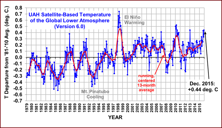
With regards to the Feb 2016 spike, I think Bob Tisdale gets it mostly right. While a spike from the El Nino is expected, the Feb 2016 seems anomalous and largely associated with a warm spike in the Arctic (of ‘weather’ origin). I would expect a few more months of anomalously warm temperatures before the El Nino fades. I’m not sure what to make of the ‘re-emergent blob’ scenario.
We won’t know what the 2016 El Nino spike looks like until the end of the year. Then we can compare the 1997/1998 temperatures with 2015/2016 temperatures in a (cherry-less) apples to apples comparison, to assess the underlying trend in temperatures from 1998-2016. The trend will undoubtedly be positive, but most likely it will remain substantially less than the trend predicted by the climate models.
And what of the years following 2016? Will we see cooling and then a continuation of flat temperatures? Or continued warming? I suspect that there will be some cooling and continued flatness. I’ve stated before that it will be another 5 years before we have the appropriate prospective on the current temperature fluctuations and whether or not the early 21st century pause is over.
We just have to grab some popcorn and watch…better stock up, this is gonna take a while.
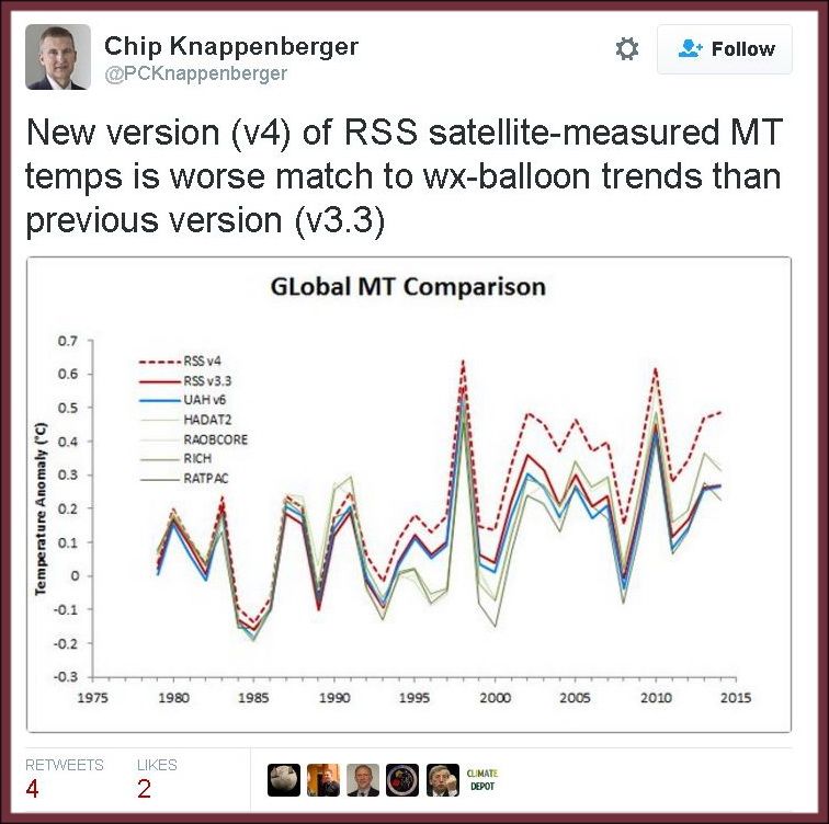
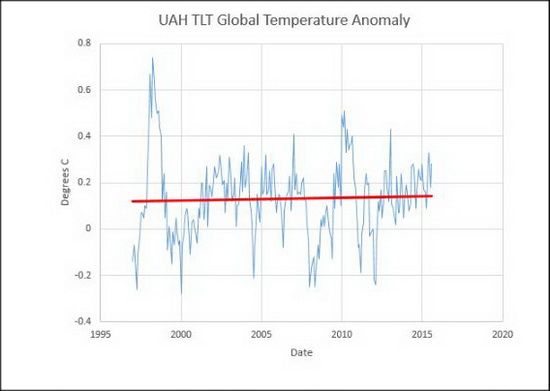
But still worth noting, EVEN IF you include the new data… we see modeling waaay overblown:
Without the new — I would say, messaged data from one satellite — we see a great comparison lining up of many tracks of reliable temps:
The models are 100% wrong. 100%
APPENDIX
…For their achievement, the Spencer-Christy team was awarded NASA’s Medal for Exceptional Scientific Achievement in 1991 and a Special Award by the American Meteorological Society in 1996 “for developing a global, precise record of earth’s temperature from operational polar-orbiting satellites, fundamentally advancing our ability to monitor climate.” In January 2002 Christy was inducted as a Fellow of the American Meteorological Society.
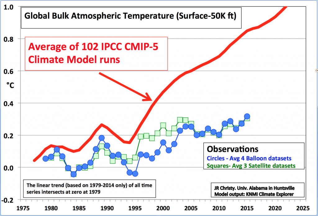
The data is published monthly, available for all to review. The satellite measurements have been a lightning rod for those who advocate that human emissions of greenhouse gases, particularly carbon dioxide (CO2), are causing significant global warming. There have been three relatively minor errors in the calculations that, when determined, were promptly corrected. Which is how science should work. The corrections involved orbital decay, orbital drift, and the cooling of the stratosphere. The measurement of temperatures, from the surface to roughly 50,000 feet (15 km) altitude, includes the layer for the “Hot Spot” and avoids the cooling stratosphere.
Calculations are now made by three separate groups, UAH, Remote Sensing Systems (RSS), and a group with the University of Washington. In addition, Christy uses four separate sets of radiosonde data from weather balloons to verify his work. The correspondence among these datasets is very close.
Also, Christy served as a contributor or lead author (2001) to the first four reports by the UN Intergovernmental Panel on Climate Change.
As state climatologist, Christy stated that, according to global climate models, the Paris Agreement to cut CO2 emissions will have an impact on temperatures so small that it cannot be measured. Further, he stated that based on research, if surface temperatures are used to estimate the greenhouse effect, daytime highs better serve the purpose than nighttime temperatures or averages. Daytimes highs are less influenced by changes in land use such as urbanization
[….]
John Christy exemplifies the perseverance, dedication to empirical science, and humanity befitting the Frederick Seitz Memorial Award.
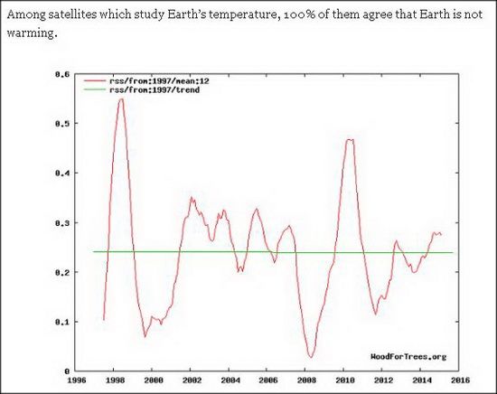
We know in order to get the temperatures NASA and NOAA wish to promote…. they do not use the data from satellites when they state such things as 2015 was the warmest year on record. Whereas a 100% of satellites agree that temperature has been steady, a 100% of the modeling has been wrong.
Instead, they use readings from places like these that they can then add an addition algorythm to to “fix” the data:
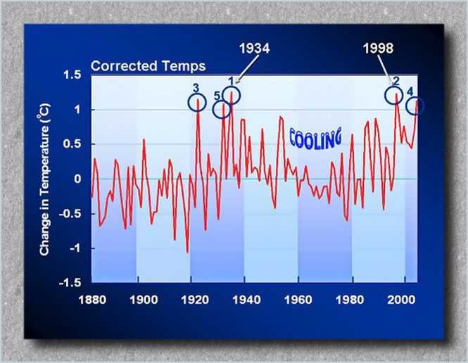
In fact, since NASA/NOAA changed the temps due to McIntyre’s work, had the hottest years listed as: 1998, 1934, 2006, 1921 and 1931. NASA then changed them to…
1934, 1998, 1921, 2006 and then 1931;
then again to, 1998, 2006, 1934, 1921, 1999.
These government, taxpayer associations that should make data for such “corrections” available to the public representatives, instead, they refused to hand over what should have been easy info to give. This obfuscation by these public institutions are summed up well by McIntyre:
…“Fixing” bad data with software is by no means an easy thing to do (as witness Mann’s unreported modification of principal components methodology on tree ring networks.) The GISS adjustment schemes (despite protestations from Schmidt that they are “clearly outlined”) are not at all easy to replicate using the existing opaque descriptions. For example, there is nothing in the methodological description that hints at the change in data provenance before and after 2000 that caused the Hansen error. Because many sites are affected by climate change, a general urban heat island effect and local microsite changes, adjustment for heat island effects and local microsite changes raises some complicated statistical questions, that are nowhere discussed in the underlying references (Hansen et al 1999, 2001). In particular, the adjustment methods are not techniques that can be looked up in statistical literature, where their properties and biases might be discerned. They are rather ad hoc and local techniques that may or may not be equal to the task of “fixing” the bad data.
Making readers run the gauntlet of trying to guess the precise data sets and precise methodologies obviously makes it very difficult to achieve any assessment of the statistical properties. In order to test the GISS adjustments, I requested that GISS provide me with details on their adjustment code. They refused. Nevertheless, there are enough different versions of U.S. station data (USHCN raw, USHCN time-of-observation adjusted, USHCN adjusted, GHCN raw, GHCN adjusted) that one can compare GISS raw and GISS adjusted data to other versions to get some idea of what they did….
He then goes on to explain the lack of detail from the GISS numbers via the U.S. compared to the global temps:
…These differences are attributed to “regional” differences and it is quite possible that this is a complete explanation. However, this conclusion is complicated by a number of important methodological differences between the U.S. and the ROW. In the U.S., despite the criticisms being rendered at surfacestations.org, there are many rural stations that have been in existence over a relatively long period of time; while one may cavil at how NOAA and/or GISS have carried out adjustments, they have collected metadata for many stations and made a concerted effort to adjust for such metadata. On the other hand, many of the stations in China, Indonesia, Brazil and elsewhere are in urban areas (such as Shanghai or Beijing). In some of the major indexes (CRU,NOAA), there appears to be no attempt whatever to adjust for urbanization. GISS does report an effort to adjust for urbanization in some cases, but their ability to do so depends on the existence of nearby rural stations, which are not always available. Thus, ithere is a real concern that the need for urban adjustment is most severe in the very areas where adjustments are either not made or not accurately made.
In its consideration of possible urbanization and/or microsite effects, IPCC has taken the position that urban effects are negligible, relying on a very few studies (Jones et al 1990, Peterson et al 2003, Parker 2005, 2006), each of which has been discussed at length at this site. In my opinion, none of these studies can be relied on for concluding that urbanization impacts have been avoided in the ROW sites contributing to the overall history….
According to data on the NOAA website, 1997 was truly the hottest year on record at 62.45 oF. The average global temperature in 2015 was 58.62 oF or 3.83 oF below the 1997 temperature.
According to data on the NOAA website, the temperatures such as the 20thcentury average temperature and annual temperature anomalies, which must be fixed, have different values in the annual global analyses.
NOAA and NASA corrected historical temperature data and fabricated temperature data in areas without temperature record systematically, widely, and uni-directionally to “cool” the past in an attempt to prove the soaring temperature trend.
NOAA and NASA made efforts to discredit their own satellite data – which is consistent with the balloon data – because it suggests a global warming hiatus since 1998 contradicting with the NOAA and NASA preferred narrative.
NOAA and NASA refused to give data and information requested by the US House of Representatives Science, Space and Technology committee. There is no reason for them to withhold the data and information, which are public domain, unless they have something to hide.
This caused people to wonder if NASA/NOAA were doing the same thing as the Europeans had been caught doing. So the requests for the records started being made. Here is the WASHINGTON TIMES talking about it in 2009:
…The center’s chief has stepped down pending an investigation into the e-mails.
The center has also had to acknowledge in response to a freedom of information request under British law that it tossed out much of the raw data that it used to draw up the temperature models that have underpinned much of the science behind global warming.
Mr. Horner suspects the same sort of data-shaving has happened at NASA’s Goddard Institute for Space Studies (GISS), another leading global warming research center.
Mark Hess, public affairs director for the Goddard Space Flight Center which runs the GISS laboratory, said they are working on Mr. Horner’s request, though he couldn’t say why they have taken so long.
[….]
NASA’s GISS was forced to update its data in 2007 after questions were raised by Steve McIntyre, who runs ClimateAudit.com.
GISS had initially listed the warmest years as 1998, 1934, 2006, 1921 and 1931. After Mr. McIntyre’s questions GISS rejiggered the list and 1934 was warmest, followed by 1998, 1921, 2006 and then 1931. But since then, the list has been rewritten again so it now runs 1998, 2006, 1934, 1921, 1999.
The institute blamed a “minor data processing error” for the changes but says it doesn’t make much difference since the top three years remain in a “statistical tie” either way.
Mr. Horner said he’s seeking the data itself, but he also wants to see the chain of e-mails from scientists discussing the changes.
The Freedom of Information Act requires agencies to respond to requests within 20 days. Mr. Horner says he’s never received an official acknowledgement of his three separate FOIA requests, but has received e-mails showing the agency is aware of them.
He said he has provided NASA with a notice of intent to sue under FOIA, but said he also hopes members of Congress get involved and demand the information be released.
NASA and CRU data are considered the backbone of much of the science that suggests the earth is warming due to manmade greenhouse gas emissions. NASA argues its data suggests this decade has been the warmest on record.
On the other hand, data from the University of Alabama-Huntsville suggests temperatures have been relatively flat for most of this decade.
In fact, JUDICIAL WATCH has had to get involved as of late 2015:
…Judicial Watch sued the Department of Commerce after the agency failed to respond to a Freedom of Information Act (FOIA) request submitted on October 30, 2015 – NOAA is a component of the Department of Commerce. The timeframe for the requested records is October 30, 2014, through October 30, 2015, and requests all documents and records of communications between NOAA officials, employees, and contractors regarding:
The methodology and utilization of night marine air temperatures to adjust ship and buoy temperature data;
The use of other global temperature datasets for both NOAA’s in-house dataset improvements and monthly press releases conveying information to the public about global temperatures;
The utilization and consideration of satellite bulk atmospheric temperature readings for use in global temperature datasets; and
A subpoena issued for the aforementioned information by Congressman Lamar Smith on October 13, 2015.
[….]
On November 26, Smith published an opinion editorial in The Washington Times, which accused NOAA of tampering with data to help promote global warming alarmism:
NOAA often fails to consider all available data in its determinations and climate change reports to the public. A recent study by NOAA, published in the journal Science, made “adjustments” to historical temperature records and NOAA trumpeted the findings as refuting the nearly two-decade pause in global warming. The study’s authors claimed these adjustments were supposedly based on new data and new methodology. But the study failed to include satellite data.
“We have little doubt that our lawsuit helped to pry these scandalous climate change report documents from the Obama administration. The Obama administration seems to care not one whit for a congressional subpoena but knows from prior experience that a Judicial Watch FOIA lawsuit cannot be ignored,” said Judicial Watch President Tom Fitton. “Given the lawless refusal to comply with our FOIA request and a congressional subpoena, we have little doubt that the documents will show the Obama administration put politics before science to advance global warming alarmism.”
Judicial Watch previously investigated alleged data manipulation by global warming advocates in the Obama administration. In 2010, Judicial Watch obtained internal documents from NASA’s Goddard Institute for Space Studies (GISS) related to a controversy that erupted in 2007 when Canadian blogger Stephen McIntyre exposed an error in NASA’s handling of raw temperature data from 2000-2006 that exaggerated the reported rise in temperature readings in the United States. According to multiple press reports, when NASA corrected the error, the new data apparently caused a reshuffling of NASA’s rankings for the hottest years on record in the United States, with 1934 replacing 1998 at the top of the list….
I have a feeling this will end badly for NASA/NOAA. Why do I say that? Because if they have nothing to hide then there is no reason for them to withhold the data and information, which are public domain.
…The documents revealed a “new climate data scandal,” Judicial Watch said in announcing the suit.
“Information provided to the committee by whistleblowers appears to show that the study was rushed to publication despite the concerns and objections of a number of NOAA employees,” according to the committee.
The Texas Republican also noted that a recent NOAA study made adjustments to historical temperature records, which led the findings to refute a nearly two-decade pause to global warming….
…Referring to last weekend’s assassination of Texas Deputy Daron Goforth, a husband and father who was shot 15 times at point blank range from behind while gassing up his patrol car, self-described black supremacist King Noble explains that what the execution of that “cracker cop” tells him is that “it’s open season on killing whites and police officers and probably killing cops, period. “It’s unavoidable, inescapable. It’s funny that that now we are moving to a time where the predator will become the prey.”
After claiming that blacks are like lions who can win a “race war” against whites, Noble declares that,
“Today, we live in a time when the white man will be picked off, and there’s nothing he can do about it. His day is up, his time is up. We will witness more executions and killing of white people and cops than we ever have before.”
“It’s about to go down. It’s open season on killing white people and crackas.”…
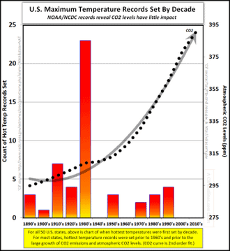
This post will be an extended rebuttal to a portion of a much longer discussion. It is in response to the cartoonists website, SKEPTICAL SCIENCE, which has been responded to in a manner that should undermine it’s validity. But alas, it does not. So first let me post the graphic that caused the person to run to this propaganda site for a rebuttal:
The year 1934 was a very hot year in the United States, ranking fourth behind 2012, 2006, and 1998. However, global warming takes into account temperatures over the entire planet. The U.S.’s land area accounts for only 2% of the earth’s total surface area. Despite the U.S. heat in 1934, the year was not so hot over the rest of the planet, and is barely holding onto a place in the hottest 50 years in the global rankings (today it ranks 49th).
There are some preliminary thoughts on this before we get into the “nitty gritty.” First, in 1933-1936 (the heat wave and wild weather span), how many countries or persons were recording weather and temperature anomalies? Common sense says that of course, not nearly as much as today. We only started measuring with satellites since 1979. Another head-tilter would be have or did the NOAA or NASA previously note other years as warmer — in the past? We will find this out as we go along.
As you read this stuff (follow links to stories, and the like), that some sites just use the basic data without correcting it. I will discuss this later in the post… but first and foremost, are there reports from those years showing temperature and weather anomalies from around the world? Yes. Here is some evidences:
Mind you, this is a small sampling from THE NO TRICKS ZONE, many more examples can be found at C3 HEADLINES, as well as a site documenting the United Kingdom’s weather for some years. So it seems that we are looking at a few year GLOBAL weather pattern. AGAIN, we did not have satellites then so we can rely on eyewitness accounts such as these.
However, I wanted to comment on some of the wrong data being used or fudged data to make climate look worse now than in the past. I have to thank the person I was discussing the issue with, because he had posted a story linked to the journal, Nature. All it had was an abstract, and while I am a member of the AAAS, the Nature journal subscription was too much. There were also a list of corrections, so I asked him for either a full article and/or some links to the corrections. Lo-and-behold he gave me a link of a corrected graph that worked in my favor:
The red area is what concerns me… but even with it is has been warmer in the past (to note the bottom line). A professor at Berkeley notes that there is a collusion between some to hide the data that counters the narrative from the “warmists.” Mind you, the following video is for 2014, but I will make a point afterwords:
MRCTV BLOG notes the following that will throw a stone into the shoe of the left about 2015 being the hottest year. Remember, the internet never forgets!
…To explain where NOAA messed up, we have to start with 1997.
In that 1997 report, they say clearly that the Global Average Temperature (GAT) was 62.45°F, based on a 30-year average (1961-1990) of the combined land and sea surface temperatures. Since we know the 1997 El Nino caused a record high spike in temperature, that means that for that 30 year period, there was no warmer GAT than 62.45°F up until that time.
Now, back to 2015. The recently released NOAA report, claiming that 2015 was the hottest year ever, says:
During 2015, the average temperature across global land and ocean surfaceswas 1.62°F (0.90°C) above the 20th century average. This was the highest among all 136 years in the 1880–2015 record, surpassing the previous record set last year by 0.29°F (0.16°C) and marking the fourth time a global temperature record has been set this century.
It was blogger Wattsupwiththat who first noticed and explained the funky math. He explains that the recent report compares 2015 to the 20th century average – but, doesn’t mention what that average temperature was.
However, it does give a 20th Century average in its November 2015 State of the Climate Report: – 13.9 degrees Celsius (57 degrees Fahrenheit):
Now, it’s math time:
According to NOAA, the global average temperature for the 20th century was 57 degrees Fahrenheit.
And the 2015 average was 1.62 degrees Fahrenheit above that average.
In other words, according to this recent NOAA report, 2015 was the hottest year ever at 58.62 degrees Fahrenheit (57+1.62).
And, that 1997 NOAA report states 1997 had an average global temperature of 62.45 degrees.
….According to my calculator:
1997’s 62.45 degrees is 3.83 degrees Fahrenheit higher than 2015’s 58.62 degrees Fahrenheit, meaning that – using NOAA’s own numbers – 2015 cannot be the hottest year on record.
As suggested monthly by the mainstream media since April 2015, NOAA and NASA officially declared that 2015 surpassed the 2014 record to become the new hottest year on record and that 2016 could be hotter than 2015! The average global temperatures calculated by NOAA and NASA, however, appear to be inaccurate and unreliable for the following reasons:
In Table 2, we’ve compiled the top five years when the most records were set. When multiple years tie for the high, each individual year gets a fraction of a “record”. So, for example, 1954 and 1933 each get a half of a record for Colorado.
According to data on the NOAA website, 1997 was truly the hottest year on record at 62.45 oF. The average global temperature in 2015 was 58.62 oF or 3.83 oF below the 1997 temperature.
According to data on the NOAA website, the temperatures such as the 20th century average temperature and annual temperature anomalies, which must be fixed, have different values in the annual global analyses.
NOAA and NASA corrected historical temperature data and fabricated temperature data in areas without temperature record systematically, widely, and uni-directionally to “cool” the past in an attempt to prove the soaring temperature trend.
NOAA and NASA made efforts to discredit their own satellite data – which is consistent with the balloon data – because it suggests a global warming hiatus since 1998 contradicting with the NOAA and NASA preferred narrative.
NOAA and NASA refused to give data and information requested by the US House of Representatives Science, Space and Technology committee. There is no reason for them to withhold the data and information, which are public domain, unless they have something to hide.
The headline “last year was the hottest year on record, this year is hotter than last year, and next year could be hotter than this year” is likely to be repeated years after years until funding for climate change is stopped!
The National Center for Policy Analysis, mentions a change a few years back:
The warmest year on record is no longer 1998 and not because it has been overtaken by a recent heat wave. National Aeronautics and Space Administration (NASA) scientist James Hansen’s famous claims about 1998 being the warmest year on record in the United States was the result of a serious math error, according to H. Sterling Burnett, a senior fellow at the National Center for Policy Analysis (NCPA).
According to NASA’s newly published data:
The hottest year on record is 1934, not 1998.
The third hottest year on record was 1921, not 2006.
Three of the five hottest years on record occurred before 1940.
Six of the top 10 hottest years occurred before 90 percent of the growth in greenhouse gas emissions during the last century occurred.
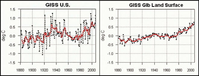
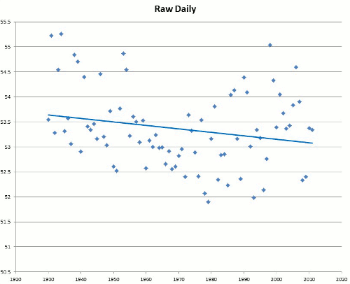
Here we see raw data vs. messaged data run through a hopper. In 2007 NASA adjusted it’s U.S. findings to match the real data:
The measured USHCN daily temperature data shows a decline in US temperatures since the 1930s. But before they release it to the public, they put it thorough a series of adjustments which change it from a cooling trend to a warming trend.
[….]
The next blink comparator shows changes in the US temperature record from GISS. It alternates between their 1999 graph and the 2012 version of the same graph. The past is cooled and the present is warmed.
Here are some examples of fudged data because of sub-standard equipment:
You’d think the answer would be obvious, but here we have a NOAA operated USHCN climate station of record providing a live experiment. It always helps to illustrate with photos. Today I surveyed a sewage treatment plant, one of 4 stations surveyed today (though I tried for 5) and found that for convenience, they had made a nice concrete walkway to allow servicing the Fisher-Porter rain gauge, which needs a paper punch tape replaced one a month.
Here is what you see in visible light:
Here is what the infrared camera sees:
Note that the concrete surface is around 22-24°C, while the grassy areas are between 12-19°C
Class 5 (error >~= 5C) – Temperature sensor located next to/above an artificial heating source, such a building, roof top, parking lot, or concrete surface.”
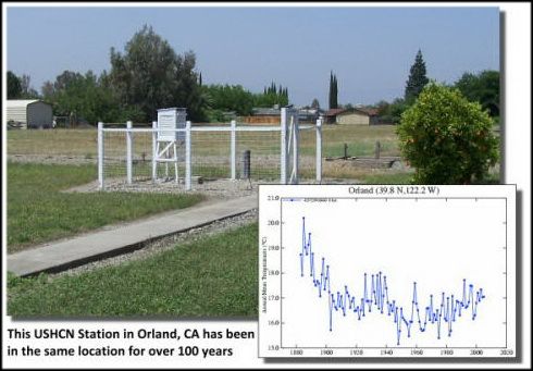
More than half of the stations the NOAA use are tainted or wrongly placed equipment. Here is an example of a well maintained station with data sets:
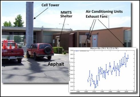
Here is data sets corresponding to a site where heat corrupts the data:
Here are even more corrupt examples of these stations placed next to air conditioner outlets, next to burners, next to lights that glow at night, asphalt surrounding them and buildings that radiate heat as well as block wind (NOTE this continually growing accumulation of these sites at WUWT):
CHANGING DATA-SETS
Another example of changing averages was noted by Steve Goddard and others — even the NOAA have acknowledge it — have been discussing recently is exemplified in Dr. Judith Carry’s post on the matter (from a larger post of mine):
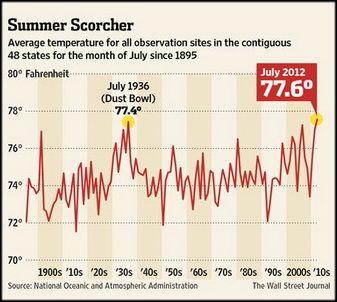
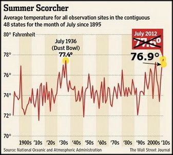
Even the Wall Street Journal chose the higher temperature reading to say that July of 2012 was July was the “hottest month in the contiguous U.S. since records began in 1895.” WUWT found this on accident and it has led to quite a few other revelations as we will see. Here is description in part of what we looking at:
Glaring inconsistencies found between State of the Climate (SOTC) reports sent to the press and public and the “official” climate database record for the United States. Using NCDC’s own data, July 2012 can no longer be claimed to be the “hottest month on record”.
[….]
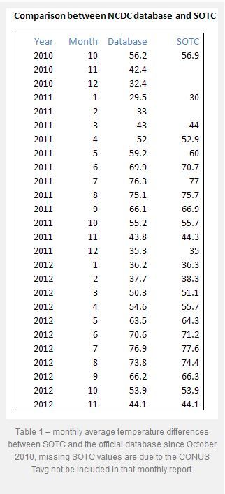
I initially thought this was just some simple arithmetic error or reporting error, a one-off event, but then I began to find it in other months when I compared the output from the NCDC climate database plotter. Here is a table of the differences I found for the last two years between claims made in the SOTC report and the NCDC database output.
[….]
In almost every instance dating back to the inception of the CONUS Tavg value being reported in the SOTC report, there’s a difference. Some are quite significant. In most cases, the database value is cooler than the claim made in the SOTC report. Clearly, it is a systemic issue that spans over two years of reporting to the press and to the public.
It suggests that claims made by NCDC when they send out these SOTC reports aren’t credible because there are such differences between the data. Clearly, NCDC means for the plotter output they link to, to be an official representation to the public, so there cannot be a claim of me using some “not fit for purpose” method to get that data….
The Wall Street Journal made a graph showing this record setting month (below-left). The more accurate temperature for July likewise is shown in the same graph (below-right):
This looking at the data sets chosen and what is used and isn’t used to support an idea that fails in every way. Combine this obvious cherry-picking with the bias, collusion, and charges against the report that the President used to route Congress, all show we have a problem Houston! But this is only the tip of the proverbial iceberg. It seems the NOAA has been skewing these temps for some time. Why? Because the left uses this as a way to promote an ever growing government and the scientists get more-and-more funding. This data fudging story is newer, and it is evolving quickley, including this newest post via Real Science where Steve Goddard notes that More Than 40% Of USHCN Station Data Is Fabricated. Here is Dr. Judith carry’s synopsis (excerpted), in which she critiques a bit Goddard’s post… but then bows to the evidence:
OK, acknowledging that Goddard made some analysis errors, I am still left with some uneasiness about the actual data, and why it keeps changing. For example, Jennifer Marohasy has been writing about Corrupting Australian’s temperature record.
In the midst of preparing this blog post, I received an email from Anthony Watts, suggesting that I hold off on my post since there is some breaking news. Watts pointed me to a post by Paul Homewood entitled Massive Temperature Adjustments At Luling, Texas. Excerpt:
So, I thought it might be worth looking in more detail at a few stations, to see what is going on. In Steve’s post, mentioned above, he links to the USHCN Final dataset for monthly temperatures, making the point that approx 40% of these monthly readings are “estimated”, as there is no raw data.
From this dataset, I picked the one at the top of the list, (which appears to be totally random), Station number 415429, which is Luling, Texas.
Taking last year as an example, we can see that ten of the twelve months are tagged as “E”, i.e estimated. It is understandable that a station might be a month, or even two, late in reporting, but it is not conceivable that readings from last year are late. (The other two months, Jan/Feb are marked “a”, indicating missing days).
But, the mystery thickens. Each state produces a monthly and annual State Climatological Report, which among other things includes a list of monthly mean temperatures by station. If we look at the 2013 annual report for Texas, we can see these monthly temperatures for Luling.
Where an “M” appears after the temperature, this indicates some days are missing, i.e Jan, Feb, Oct and Nov. (Detailed daily data shows just one missing day’s minimum temperature for each of these months).
Yet, according to the USHCN dataset, all ten months from March to December are “Estimated”. Why, when there is full data available?
But it gets worse. The table below compares the actual station data with what USHCN describe as “the bias-adjusted temperature”. The results are shocking.
In other words, the adjustments have added an astonishing 1.35C to the annual temperature for 2013. Note also that I have included the same figures for 1934, which show that the adjustment has reduced temperatures that year by 0.91C. So, the net effect of the adjustments between 1934 and 2013 has been to add 2.26C of warming.
Note as well, that the largest adjustments are for the estimated months of March – December. This is something that Steve Goddard has been emphasising.
It is plain that these adjustments made are not justifiable in any way. It is also clear that the number of “Estimated” measurements made are not justified either, as the real data is there, present and correct.
Watts appears in the comments, stating that he has contacted John Nielsen-Gammon (Texas State Climatologist) about this issue. Nick Stokes also appears in the comments, and one commenter finds a similar problem for another Texas station.
Homewood’s post sheds light on Goddard’s original claim regarding the data drop out (not just stations that are no longer reporting, but reporting stations that are ‘estimated’). I infer from this that there seems to be a real problem with the USHCN data set, or at least with some of the stations. Maybe it is a tempest in a teacup, but it looks like something that requires NOAA’s attention. As far as I can tell, NOAA has not responded to Goddard’s allegations. Now, with Homewood’s explanation/clarification, NOAA really needs to respond….
So we see in the above, that temperatures can be changed years later as the totality of the data is included. What was considered the hottest falls to just an average month in the heat index.
And this has — within the past few months — turned into a very large debate.
EQUIPMENT FAIL II
Here is another example of older/faulty equipment:
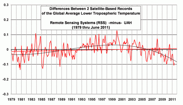
A Quick Note about the Difference between RSS and UAH TLT data
There is a noticeable difference between the RSS and UAH lower troposphere temperature anomaly data. Dr. Roy Spencer discussed this in his July 2011 blog post On the Divergence Between the UAH and RSS Global Temperature Records. In summary, John Christy and Roy Spencer believe the divergence is caused by the use of data from different satellites. UAH has used the NASA Aqua AMSU satellite in recent years, while as Dr. Spencer writes:
…RSS is still using the old NOAA-15 satellite which has a decaying orbit, to which they are then applying a diurnal cycle drift correction based upon a climate model, which does not quite match reality.
While the two lower troposphere temperature datasets are different in recent years, UAH believes their data are correct, and, likewise, RSS believes their TLT data are correct. Does the UAH data have a warming bias in recent years or does the RSS data have cooling bias? Until the two suppliers can account for and agree on the differences, both are available for presentation.
The bottom line is that those wishing to expand regulation and laws and taxes on the rest of us fudge the facts. But facts-are-facts. And the ship is sinking for these lefties.


